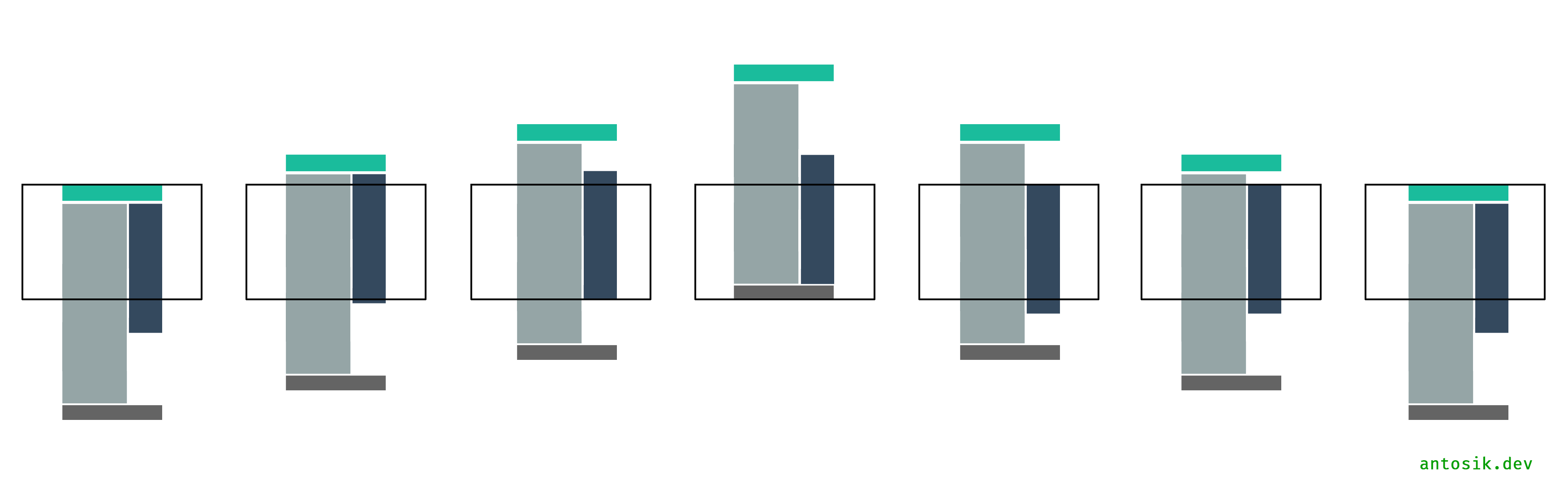
I was looking for the exact same thing. Apparently I needed to search for some obscure terms just to find a similar question with the graphic. Turns out it's exactly what I was looking for. I couldn't find any plugins so I decided to make it myself. Hopefully someone will see this and refine it.
Here's a quick and dirty sample html I'm using.
<div id="main">
    <div class="col-1">
    </div>
    <div class="col-2">
        <div class="side-wrapper">
            sidebar content
        </div>
    </div>
</div>
Here's the jQuery I made:
var lastScrollPos = $(window).scrollTop();
var originalPos = $('.side-wrapper').offset().top;
if ($('.col-2').css('float') != 'none') {
    $(window).scroll(function(){
        var rectbtfadPos = $('.rectbtfad').offset().top + $('.rectbtfad').height();
        // scroll up direction
        if ( lastScrollPos > $(window).scrollTop() ) {
            // unstick if scrolling the opposite direction so content will scroll with user
            if ($('.side-wrapper').css('position') == 'fixed') {
                $('.side-wrapper').css({
                    'position': 'absolute',
                    'top': $('.side-wrapper').offset().top + 'px',
                    'bottom': 'auto'
                });
            }
            // if has reached the original position, return to relative positioning
            if ( ($(window).scrollTop() + $('#masthead').height()) < originalPos ) {
                $('.side-wrapper').css({
                    'position': 'relative',
                    'top': 'auto',
                    'bottom': 'auto'
                });
            }
            // sticky to top if scroll past top of sidebar
            else if ( ($(window).scrollTop() + $('#masthead').height()) < $('.side-wrapper').offset().top && $('.side-wrapper').css('position') == 'absolute' ) {
                $('.side-wrapper').css({
                    'position': 'fixed',
                    'top': 15 + $('#masthead').height() + 'px', // padding to compensate for sticky header
                    'bottom': 'auto'
                });
            }
        }
        // scroll down
        else {
            // unstick if scrolling the opposite direction so content will scroll with user
            if ($('.side-wrapper').css('position') == 'fixed') {
                $('.side-wrapper').css({
                    'position': 'absolute',
                    'top': $('.side-wrapper').offset().top + 'px',
                    'bottom': 'auto'
                });
            }
            // check if rectbtfad (bottom most element) has reached the bottom
            if ( ($(window).scrollTop() + $(window).height()) > rectbtfadPos && $('.side-wrapper').css('position') != 'fixed' ) {
                $('.side-wrapper').css({
                    'width': $('.col-2').width(),
                    'position': 'fixed',
                    'bottom': '0',
                    'top': 'auto'
                });
            }
        }
        // set last scroll position to determine if scrolling up or down
        lastScrollPos = $(window).scrollTop();

    });
}
Some notes:
- .rectbtfad is the bottom most element in my sidebar
- I'm using the height of my #masthead because it's a sticky header so it needs to
compensate for it
- There's a check for col-2 float since I'm using a responsive design and don't want this activating on smaller screens
If anyone can refine this a bit more that'd be great.
