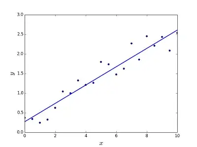
I have a dataset that looks like that, I want to plot the exact same bar plot in R.

This is what I've been trying:
barplot(as.matrix(table[,2:8]), beside = T, ylim= c(0,1),
        col = c("red", "blue", "green", "yellow",
                "orange", "purple", "cyan", "grey",
                "deeppink", "red4", "black", "brown"))
I get a bar plot, but now when I want to change the labels instead of a,b,c...g to this:
(-0.20,-0.15)
(-0.15,-0.10)
.
.
.
(0.20,0.25)
I get an X character in front of every label I was trying to write:

Thank you.