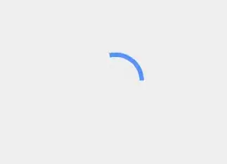
I want to make a material design circular progress bar like the one in Inbox by Gmail android app. How do I achieve this (in pre-lollipop devices)?
Am trying to achieve a similar effect like this. Inbox by Gmail material design circular progress bar
I want to make a material design circular progress bar like the one in Inbox by Gmail android app. How do I achieve this (in pre-lollipop devices)?
Am trying to achieve a similar effect like this. Inbox by Gmail material design circular progress bar
<ProgressBar
android:id="@+id/loading_spinner"
android:layout_width="wrap_content"
android:layout_height="wrap_content"
android:indeterminateTintMode="src_atop"
android:indeterminateTint="@color/your_customized_color"
android:layout_gravity="center" />
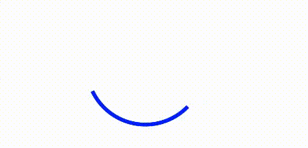
The effect looks like this:
Nice implementation for material design circular progress bar (from rahatarmanahmed/CircularProgressView),
<com.github.rahatarmanahmed.cpv.CircularProgressView
    xmlns:app="http://schemas.android.com/apk/res-auto"
    android:id="@+id/progress_view"
    android:layout_width="40dp"
    android:layout_height="40dp"
    app:cpv_indeterminate="true"/>
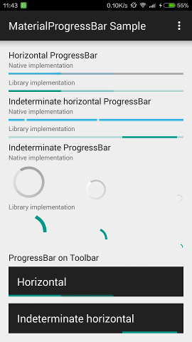
I've backported the three Material Design progress drawables to Android 4.0, which can be used as a drop-in replacement for regular ProgressBar, with exactly the same appearance.
These drawables also backported the tinting APIs (and RTL support), and uses ?colorControlActivated as the default tint. A MaterialProgressBar widget which extends ProgressBar has also been introduced for convenience.
DreaminginCodeZH/MaterialProgressBar
This project has also been adopted by afollestad/material-dialogs for progress dialog.
On Android 4.4.4:
On Android 5.1.1:

With the Material Components library you can use the CircularProgressIndicator:
Something like:
<com.google.android.material.progressindicator.CircularProgressIndicator
      android:indeterminate="true"
      android:layout_width="wrap_content"
      android:layout_height="wrap_content"
      app:indicatorColor="@array/progress_colors"
      app:indicatorSize="xxdp"
      app:indeterminateAnimationType="contiguous"/>
where array/progress_colors is an array with the colors:
  <integer-array name="progress_colors">
    <item>@color/yellow_500</item>
    <item>@color/blue_700</item>
    <item>@color/red_500</item>
  </integer-array>
Note: it requires at least the version 1.3.0
Update
As of 2019 this can be easily achieved using ProgressIndicator, in Material Components library, used with the Widget.MaterialComponents.ProgressIndicator.Circular.Indeterminate style.
For more details please check Gabriele Mariotti's answer below.
Old implementation
Here is an awesome implementation of the material design circular intermediate progress bar https://gist.github.com/castorflex/4e46a9dc2c3a4245a28e. The implementation only lacks the ability add various colors like in inbox by android app but this does a pretty great job.
In addition to cozeJ4's answer, here's updated version of that gist
Original one lacked imports and contained some errors. This one is ready to use.
The platform uses a vector drawable, so you can't reuse it as in in older versions.
However, the support lib v4 contains a backport of this drawable :
http://androidxref.com/5.1.0_r1/xref/frameworks/support/v4/java/android/support/v4/widget/MaterialProgressDrawable.java
It has a @hide annotation (it is here for the SwipeRefreshLayout), but nothing prevents you from copying this class in your codebase.
Was looking for a way to do this using simple xml, but couldn't find any helpful answers, so came up with this.
This works on pre-lollipop versions too, and is pretty close to the material design progress bar. You just need to use this drawable as the indeterminate drawable in the ProgressBar layout.
<?xml version="1.0" encoding="utf-8"?><!--<layer-list>-->
<rotate xmlns:android="http://schemas.android.com/apk/res/android"
    android:fromDegrees="0"
    android:toDegrees="360">
    <layer-list>
        <item>
            <rotate xmlns:android="http://schemas.android.com/apk/res/android"
                android:fromDegrees="-90"
                android:toDegrees="-90">
                <shape
                    android:innerRadiusRatio="2.5"
                    android:shape="ring"
                    android:thickness="2dp"
                    android:useLevel="true"><!-- this line fixes the issue for lollipop api 21 -->

                    <gradient
                        android:angle="0"
                        android:endColor="#007DD6"
                        android:startColor="#007DD6"
                        android:type="sweep"
                        android:useLevel="false" />
                </shape>
            </rotate>
        </item>
        <item>
            <rotate xmlns:android="http://schemas.android.com/apk/res/android"
                android:fromDegrees="0"
                android:toDegrees="270">
                <shape
                    android:innerRadiusRatio="2.6"
                    android:shape="ring"
                    android:thickness="4dp"
                    android:useLevel="true"><!-- this line fixes the issue for lollipop api 21 -->
                    <gradient
                        android:angle="0"
                        android:centerColor="#FFF"
                        android:endColor="#FFF"
                        android:startColor="#FFF"
                        android:useLevel="false" />
                </shape>
            </rotate>
        </item>
    </layer-list>
</rotate>
set the above drawable in ProgressBar as follows:
android:indeterminatedrawable="@drawable/above_drawable"
Loader with background.
Add to your layout:
<androidx.constraintlayout.widget.ConstraintLayout
    android:id="@+id/loader"
    android:layout_width="35dp"
    android:layout_height="35dp"
    android:visibility="visible"
    app:layout_constraintStart_toStartOf="parent"
    app:layout_constraintBottom_toBottomOf="parent"
    app:layout_constraintEnd_toEndOf="parent"
    app:layout_constraintTop_toTopOf="parent">

    <ImageView
        android:id="@+id/background_loader"
        android:layout_width="match_parent"
        android:layout_height="match_parent"
        android:src="@drawable/background_loader"
        app:layout_constraintStart_toStartOf="parent"
        app:layout_constraintTop_toTopOf="parent"
        app:layout_constraintEnd_toEndOf="parent"
        app:layout_constraintBottom_toBottomOf="parent" />

    <ProgressBar
        android:id="@+id/spinner_loader"
        android:layout_width="31dp"
        android:layout_height="31dp"
        android:indeterminateTintMode="src_atop"
        android:indeterminateTint="@color/blue"
        app:layout_constraintTop_toTopOf="parent"
        app:layout_constraintStart_toStartOf="parent"
        app:layout_constraintBottom_toBottomOf="parent"
        app:layout_constraintEnd_toEndOf="parent" />
</androidx.constraintlayout.widget.ConstraintLayout>
Then add the background_loader.xml file to res/drawable:
<?xml version="1.0" encoding="utf-8"?>
<shape
    xmlns:android="http://schemas.android.com/apk/res/android"
    android:shape="oval">
    <solid android:color="#ffffff"/>
    <size android:width="35dp" android:height="35dp"/>
</shape>
Managing the visibility of the loader in the code:
class MainActivity : AppCompatActivity() {
    private lateinit var loader: ConstraintLayout

    override fun onCreate(savedInstanceState: Bundle?) {
        super.onCreate(savedInstanceState)
        setContentView(R.layout.activity_main)

        loader = findViewById(R.id.loader)
        loader.visibility = View.VISIBLE
    }
}
Result:
