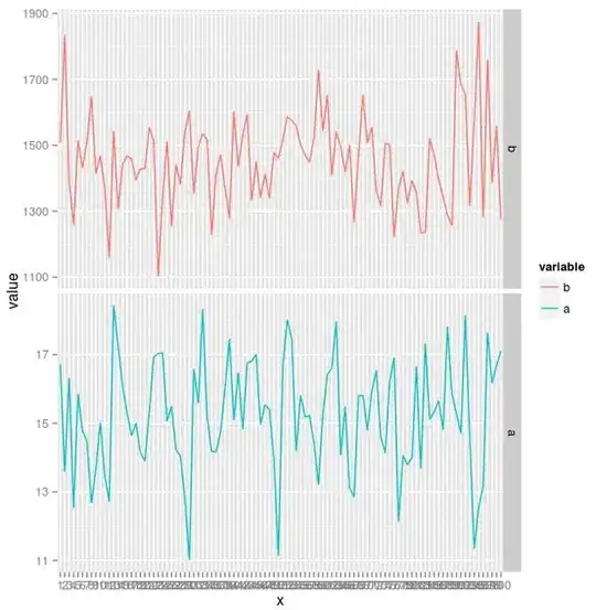
I would like to create a plot with multiple breaks of different sized intervals on the y axis. The closest post I could find is this Show customised X-axis ticks in ggplot2 But it doesn't fully solve my problem.
 # dummy data

 require(ggplot2)
 require(reshape2)

 a<-rnorm(mean=15,sd=1.5, n=100)
 b<-rnorm(mean=1500,sd=150, n=100)
 df<-data.frame(a=a,b=b)
 df$x <- factor(seq(100), ordered = T)
 df.m <- melt(df)

 ggplot(data = df.m, aes(x = x, y=value, colour=variable, group=variable)) +
 geom_line() + scale_y_continuous(breaks = c(seq(from = 0, to = 20, by = 1),
 seq(from = 1100, to = max(y), by = 100))) +
 theme(axis.text.x = element_text(angle = 90, hjust = 1))
The problem is how to get the first set of breaks to be proportional to the second (thus visible).
Any pointer would be very much appreciated, thanks!