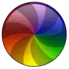
I'm trying to create Apple's OS X circle loading animation.
What I have tried so far:
.animation-wrapper {
  width: 200px;
  height: 200px;
  border: 1px solid black;
  border-radius: 50%;
  position: relative;
  overflow: hidden;
  filter: brightness(0.8);
  -webkit-filter: brightness(0.8);
}
.pie-piece1 {
  position: absolute;
  width: 50%;
  height: 50%;
  bottom: 0;
  left: 0;
  background: linear-gradient(to right, rgba(255, 0, 0, 1) 0%, rgba(255, 255, 0, 1) 100%);
}
.pie-piece2 {
  position: absolute;
  width: 50%;
  height: 50%;
  bottom: 0;
  right: 0;
  background: linear-gradient(to right, rgba(255, 255, 0, 1) 0%, rgba(0, 255, 0, 1) 100%);
}
.pie-piece3 {
  position: absolute;
  width: 50%;
  height: 50%;
  top: 0;
  left: 0;
  background: linear-gradient(to right, rgba(255, 0, 0, 1) 0%, rgba(255, 0, 255, 1) 100%);
}
.pie-piece4 {
  position: absolute;
  width: 50%;
  height: 50%;
  top: 0;
  right: 0;
  background: linear-gradient(to right, rgba(255, 0, 255, 1) 0%, rgba(0, 0, 255, 1) 100%);
}
.rotating-spinners {
  position: absolute;
}
.spike {
  fill: rgba(22, 22, 22, 0.5);
}
<figure class="animation-wrapper">
<div class="pie-piece1"></div>
<div class="pie-piece2"></div>
<div class="pie-piece3"></div>
<div class="pie-piece4"></div>
<svg class="rotating-spinners" width="100%" height="100%" viewBox="0 0 100 100" xmlns="http://www.w3.org/2000/svg" xmlns:xlink="http://www.w3.org/1999/xlink">
<defs>
<path id="spin-part" class="spike" d="M 65,-40 C 65,-40 80,20 50,50 60,40 50,-40 50,-40Z" />
</defs>
<use x="0" y="0" xlink:href="#spin-part" />
<use x="0" y="0" xlink:href="#spin-part" transform="rotate(60, 50, 50)" />
<use x="0" y="0" xlink:href="#spin-part" transform="rotate(120, 50, 50)" />
<use x="0" y="0" xlink:href="#spin-part" transform="rotate(180, 50, 50)" />
<use x="0" y="0" xlink:href="#spin-part" transform="rotate(240, 50, 50)" />
<use x="0" y="0" xlink:href="#spin-part" transform="rotate(300, 50, 50)" />
</svg>
</figure>The linear gradients don't seem to line up correctly since i couldn't find a way to make the gradients go in two directions.
Is there a way to create this using only CSS or SVG without mixing them like I have done?
Or are there other solutions I can use like canvas or some kind of image magic?

