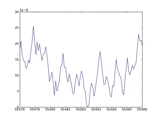
I'm not totally sure I understood what you want, but this is an attempt to solve [what I think is] your problem:
First, the vector you have is very short, and the changes on freq are very abrupt, so that will make for a very "tile-like" feeling of the plot. You'll need to address that first. My approach is using a spline interpolation:
newdf=data.frame(x=spline(df)[[1]],freq=spline(df)[[2]],y=rep(1,times=3*length(df$x)))
Please notice that I also created a y vector in the data frame.
Now it can be plotted using lattice's levelplot:
levelplot(freq~x*y,data=newdf)
Which produces a smoother plot (as I understand, that's what you need). It can be also plotted with ggplot:
ggplot(newdf,aes(x=x,y=y,fill=freq))+geom_tile()
========== EDIT TO ADD ============
Please notice that you can control the new vector length with spline's n argument, making for an even smoother transition (spline(df,n=100)[[1]]) If you follow this option, make sure you adjust the times you repeat 1 in y's definition!!. Default n is 3x the length of the input vector.


