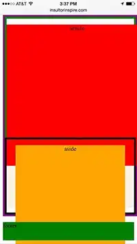
Problem: Safari displays overlapping elements in CSS media query styling.
On Chrome and Firefox, everything displays properly. Here's a screenshot:
However, when I test on Safari desktop ( Safari 8.0, with browser width adjusted to mobile size) and on an actual mobile device (iphone 6.0 / iOS 8.3 / safari browser) -- article is getting overlapped by aside, which is overlapped by footer.
I have found an undesirable workaround -- by setting the min-height in the media query styling to something like 600px (for example). This will position the content so it would look ok on mobile device.
Since this is not a one-page website, I need the css to do this for me automatically, without me having to figure out the correct min-height on every page.
I'm new at this, so if you can please provide actual code, that will be most helpful. Your help is appreciated.
<!DOCTYPE html>
<meta name="viewport" content="width=device-width, initial-scale=1">

<style>

#main {
border: 5px solid purple;
width:80%;
min-height:500px;
display: -webkit-flex;
display:         flex;
-webkit-flex-flow: row;
        flex-flow: row;
}

#main > article {
    min-width:400px;
      border: 5px solid green;
    -webkit-flex: 60%;
            flex: 60%;
}

#main > footer {
      border: 5px solid yellow;
}

/* Too narrow to support two columns */
@media all and (max-width: 640px) {

    #main {
    width:100%;
    -webkit-flex-flow: column;
          flex-direction: column;
    }

    #main > article {
    min-height:320px;
    }

    #main > aside {
    min-height:200px;
    }
}
</style>

<div id="container">
    <center>
    <div id="main">
      <article>
      <div style="background-color:linen;width:100%;height:500px" id="div1">
        <div style="background-color:red;width:386px;height:386px">
        <p>article</p>
        </div>
      </div>
      </article>

      <aside style="border:5px solid black">
      <center>
      <div style="background-color:orange;width:300px;height:300px" id="div2">
      <p>aside</p>
      </div>
      </center>
      </aside>
    </div>
    </center>

    <footer>
    <div style="background-color:green;width:100%;height:50px" id="div3">
    <p>footer</p>
    </div>
    </footer>
</div>

