I am using the Kube CSS framework and am having troubles with the responsive grid.
I have html like this, which was taken from the first example here
<body>

  <div class="units-row">
      <div class="unit-50">Hello world</div>
      <div class="unit-50">It's Kube Grid System</div>
  </div>

  <style>
    .unit-50 {
      text-align: center;
      background-color: purple;
      color: white;
      padding: 2em;
    }
  </style>

</body>
The page renderers the same in the example on desktop

The problem is when I am on mobile. When I open chrome dev tools on the Kube grid examples, the columns are responsive and get width 100%.
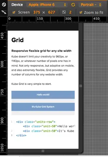
This is what my page looks like on mobile
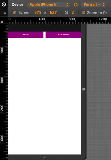
It appears like my screen width is >900px when it is 375px on Kubes grid example. I do not have any external css being loaded that would modify this.
I know my site is still responsive because when I resize the browser window the columns do get width 100%.

For some reason on mobile my screen width is much higher than on the Kube CSS website. Do I need to do anything to make my page behave this way?
This is really confusing me as it looks like it should work.