Let's say we have a flex container with a width of 400px.
Inside this container are three flex items:
:nth-child(1) { flex: 0 2 300px; }   /* flex-grow, flex-shrink, flex-basis */
:nth-child(2) { flex: 0 1 200px; }
:nth-child(3) { flex: 0 2 100px; }
So the total width of flex items is 600px and the free space in the container is -200px.
With help from this question, this article, and the flexbox spec, I've learned the basic formula for distributing negative free space among flex items:
Step 1
Multiply each shrink value by its basis and add them all together:
:nth-child(1)  2 * 300 = 600
:nth-child(2)  1 * 200 = 200
:nth-child(3)  2 * 100 = 200
TOTAL = 1000
Step 2
Divide each item above by the total to determine the shrink factor:
:nth-child(1)  600 / 1000 = .6
:nth-child(2)  200 / 1000 = .2
:nth-child(3)  200 / 1000 = .2
Step 3
Multiply the shrink factor by the negative free space to determine the space removed from each item:
:nth-child(1)  .6 * -200px = -120px
:nth-child(2)  .2 * -200px =  -40px
:nth-child(3)  .2 * -200px =  -40px
So, the computed size of each flex item should be:
:nth-child(1)  300px - 120px = 180px
:nth-child(2)  200px -  40px = 160px
:nth-child(3)  100px -  40px =  60px
Tested in Chrome, Firefox and IE11, the numbers check out. The calculation works perfectly.
.flex {
display: flex;
width: 400px;
height: 50px;
margin: 0;
padding: 0;
list-style: none;
text-align: center;
}
.flex li:nth-child(1) {
flex: 0 2 300px;
background: orange;
}
.flex li:nth-child(2) {
flex: 0 1 200px;
background: chartreuse;
}
.flex li:nth-child(3) {
flex: 0 2 100px;
background: aqua;
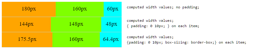
}<ul class="flex1 flex">
<li>180px</li>
<li>160px</li>
<li>60px</li>
</ul>The Problem
When padding is introduced, however, the shrink results are different. When padding is applied along with box-sizing: border-box, this results in yet another set of numbers.
What's the flex-shrink calculation when padding and box-sizing are involved?
.flex {
  display: flex;
  width: 400px;
  height: 50px;
  margin: 0;
  padding: 0;
  list-style: none;
  text-align: center;
  border-bottom: 1px solid #ccc;
}

.flex li:nth-child(1) {
  flex: 0 2 300px;
  background: orange;
}

.flex li:nth-child(2) {
  flex: 0 1 200px;
  background: chartreuse;
}

.flex li:nth-child(3) {
  flex: 0 2 100px;
  background: aqua;
}

.flex2 li {
  padding: 0 10px;
}

.flex3 li {
  padding: 0 10px;
  box-sizing: border-box;
}
<ul class="flex1 flex">
<li>180px</li>
<li>160px</li>
<li>60px</li>
</ul>
<ul class="flex2 flex">
<li>144px</li>
<li>148px</li>
<li>48px</li>
</ul>
<ul class="flex3 flex">
<li>175.5px</li>
<li>160px</li>
<li>64.4px</li>
</ul>