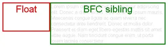
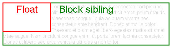
That's because the float is out-of-flow, so it overlaps .table-wrap. But it reduces the length of line boxes inside it.

Then it seems the margin is ignored, but in fact it's not: .table-wrap is really moved to the left, but the contents aren't due to the float.
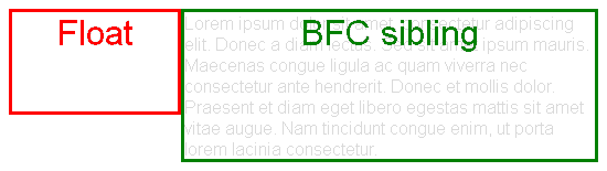
Instead, you should make .table-wrap establish a new block formatting context (BFC). Then it won't overlap the float.
For example, you can establish a BFC with overflow: hidden, display: inline-block or float: left. Here the former would be bad because it would hide the content overflowing due to the negative margin, so use one of the others.
.side {
width: 200px;
float: left;
position: relative;
}
.table-wrap {
display: inline-block; /* Establish Block Formatting Context */
margin-left: -150px; /* Now this works */
}
.table {
display: flex;
}
.stuff {
width: 100px;
height: 100px;
background: green
}
<div class="content">
  <div class="side">
    side content
  </div>
  <div class="table-wrap">
    <div class="table">
      <div class="item"></div>
      <div class="stuff"></div>
    </div>
  </div>
</div>
Alternatively, since you are already using flexbox, you can make .content be a flex container instead of floating .side
.content {
display: flex;
}
.side {
width: 200px;
position: relative;
}
.table-wrap {
margin-left: -150px; /* Now this works */
}
.table {
display: flex;
}
.stuff {
width: 100px;
height: 100px;
background: green
}
<div class="content">
  <div class="side">
    side content
  </div>
  <div class="table-wrap">
    <div class="table">
      <div class="item"></div>
      <div class="stuff"></div>
    </div>
  </div>
</div>