I'm building an app with Meteor, React and Material-UI. I have a custom left nav component based on Drawer.
class LeftNav extends Component {

    constructor(props){
        super(props);
    }

    render() {

        return (
            <Drawer open={this.props.open}
                            docked={false}
                            onRequestChange={this.props.handleOnRequestChange}
            >
                <Card >
                    <CardMedia overlay={<div><Avatar src='avatar.png' size={50}  style={styles.avatar} /> <CardTitle title="Phil Cruz" subtitle="phil@philcruz.com" titleColor={darkWhite} subtitleColor={lightWhite}/></div>} >
                        <img src="/left_nav_wallpaper.jpg" />
                    </CardMedia>
                </Card>
                <MenuItem primaryText="testdomain1.com" leftIcon={<ActionGrade />}  />
                <MenuItem primaryText="testdomain2.com" leftIcon={<ActionHttp />}/>
                <MenuItem primaryText="Add site..." leftIcon={<ContentAdd />} />
                <Divider />
                <MenuItem primaryText="Settings" leftIcon={<Settings />} />
                <MenuItem primaryText="Help & About" leftIcon={<HelpOutline />} />
        </Drawer>
        );
    }
};
I want to make it so it behaves like the Google InBox left nav/drawer. It has 3 sections: The top with the cover image and avatar, middle section and the bottom section.
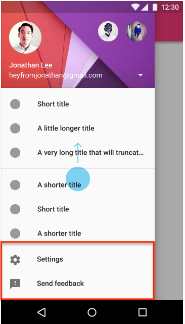
I want the same behavior where:
- the bottom menu items are fixed to the bottom (in red in the below image)
- the top section can scroll
How can I do that?