Trying to create a gallery of hexagons, I searched on the internet and I found some examples, and I created a gallery-like this (this is my test hosting site, and that galley designed by me by referring some links)
I'm using this code :
#hexGrid {
  overflow: hidden;
  width: 60%;
  margin: 0 auto;
  padding: 0.866% 0;
  font-family: 'Raleway', sans-serif;
  font-size: 15px;
}
#hexGrid:after {
  content: "";
  display: block;
  clear: both;
}
.hex {
  position: relative;
  list-style-type: none;
  float: left;
  overflow: hidden;
  visibility: hidden;
  outline: 1px solid transparent;  /* fix for jagged edges in FF on hover transition */
  -webkit-transform: rotate(-60deg) skewY(30deg) translatez(-1px);
  -ms-transform: rotate(-60deg) skewY(30deg) translatez(-1px);
  transform: rotate(-60deg) skewY(30deg) translatez(-1px);
}
.hex * {
  position: absolute;
  visibility: visible;
  outline: 1px solid transparent;  /* fix for jagged edges in FF on hover transition */
}
.hexIn {
  display: block;
  width: 100%;
  height: 100%;
  text-align: center;
  color: #fff;
  overflow: hidden;
  -webkit-transform: skewY(-30deg) rotate(60deg);
  -ms-transform: skewY(-30deg) rotate(60deg);
  transform: skewY(-30deg) rotate(60deg);
}
/*** HEX CONTENT **********************************************************************/

.hex div {
  left: -100%;
  right: -100%;
  width: auto;
  height: 100%;
  margin: 0 auto;
}
.hex h1,
.hex p {
  width: 102%;
  left: -1%;  /* prevent line on the right where background doesn't cover image */
  padding: 5%;  box-sizing: border-box;
  background-color: rgba(0, 128, 128, 0.8);
  font-weight: 300;
  -webkit-transition: -webkit-transform .2s ease-out, opacity .3s ease-out;
  transition: transform .2s ease-out, opacity .3s ease-out;
}
.hex h1 {
  bottom: 50%;
  padding-top: 50%;
  font-size: 1.5em;
  z-index: 1;
  -webkit-transform: translateY(-100%) translatez(-1px);
  -ms-transform: translateY(-100%) translatez(-1px);
  transform: translateY(-100%) translatez(-1px);
}
.hex h1:after {
  content: '';
  position: absolute;
  bottom: 0;
  left: 45%;
  width: 10%;
  text-align: center;
  border-bottom: 1px solid #fff;
}
.hex p {
  top: 50%;
  padding-bottom: 50%;
  -webkit-transform: translateY(100%) translatez(-1px);
  -ms-transform: translateY(100%) translatez(-1px);
  transform: translateY(100%) translatez(-1px);
}
@media (min-width: 1201px) {  /* <- 5-4  hexagons per row */
  .hex {
    width: 24.25%;    /* = (100-3) / 4 */
    padding-bottom: 28.001%;    /* =  width / sin(60deg) */
  }
  .hex:nth-child(7n+5),  .hex:nth-child(7n+6),  .hex:nth-child(7n+7) {
    margin-top: -6.134%;
    margin-bottom: -6.134%;
    -webkit-transform: translateX(50%) rotate(-60deg) skewY(30deg);
    -ms-transform: translateX(50%) rotate(-60deg) skewY(30deg);
    transform: translateX(50%) rotate(-60deg) skewY(30deg);
  }
  .hex:nth-child(7n+5):last-child,  .hex:nth-child(7n+6):last-child,  .hex:nth-child(7n+7):last-child {
    margin-bottom: 0;
  }
  .hex:nth-child(7n+2),  .hex:nth-child(7n+6) {
    margin-left: 1%;
    margin-right: 1%;
  }
  .hex:nth-child(7n+3) {
    margin-right: 1%;
  }
  .hex:nth-child(7n+8) {
    clear: left;
  }
  .hex:nth-child(7n+5) {
    clear: left;
    margin-left: 0.5%;
  }
}
<ul id="hexGrid">
<li class="hex">
<a class="hexIn" href="#">
<div class="mono-green"></div>
<!--Empty Hex-->
</a>
</li>
<li class="hex">
<a class="hexIn" href="#">
<div class="mono-violet"></div>
<h1>2</h1>
</a>
</li>
</ul>
<!-- like this 11 hexagons but i'll remove 4 of them to create that -->I want to arrange hexagons like this :
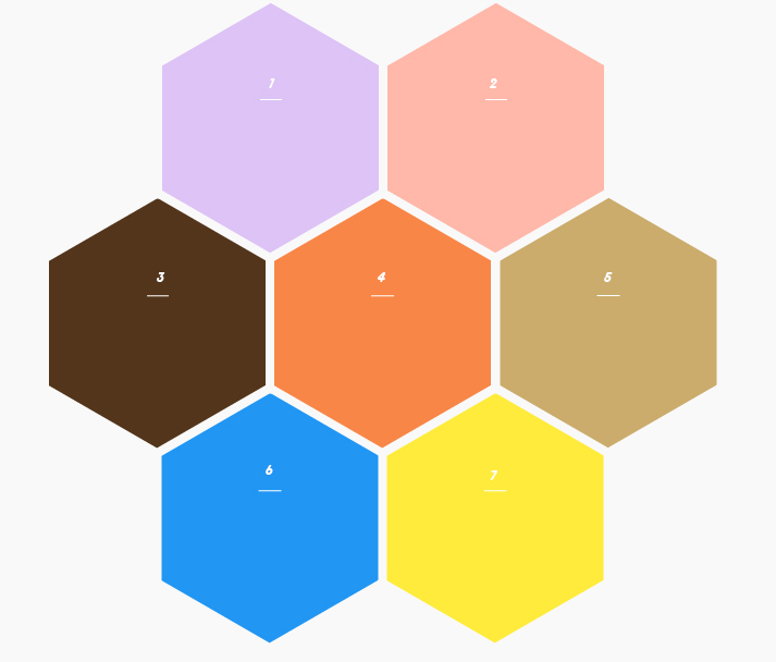
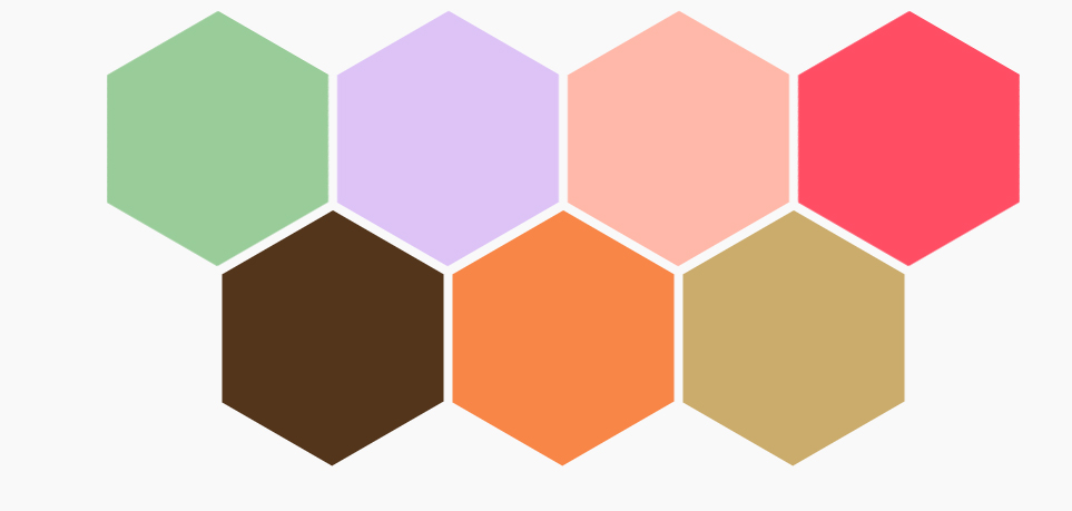
I'm using 11 hexagons now, if I remove 4 hex's like in the above structure, it become like this :
But I need 2-3-2 structure! What should I modify in this code?