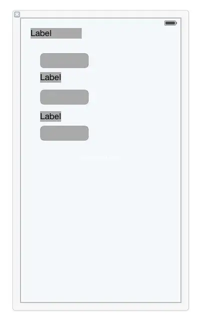
How can I do this sort of a gallery style layout with flex box?
I have a <ul> with <li> in them. The first <li> I want to be double size and have the rest of the items flow around it.
I can layout the items using flexbox with the following code, but when I go double size on the first item I can't figure out how to reflow the boxes to fit around it as pictured.
ul, li {
    padding: 0;
    margin: 0;
}

ul {
    display: flex;
    justify-content: flex-start;
    list-style-type: none;
    align-items: flex-start;
    flex-wrap: wrap;
    flex-direction: row;
}

ul > li {
    width: 15rem;
    height: 15rem;
    order: 2;
}

ul > li.active {
    width: 30rem;
    height: 30rem;
    order: 1;
}
I have some javascript that cycles through the <li> tags and adds the .active class. Using order: 1 I can move the currently active image to the first spot (the double-sized version).