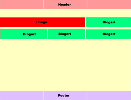
I am new to css grids, and I am trying to build a page with this layout:
The problem I have is the .main class and the grid inside the container grid.
I think I have the wrong setup for the grid in .main.
For the upper container .container, I can see that three columns layout is working.
On the first row, I want the div image div to span 2 out of three columns, and blogart div to take up one column.
The second row should have three blogart divs spaning one column each.
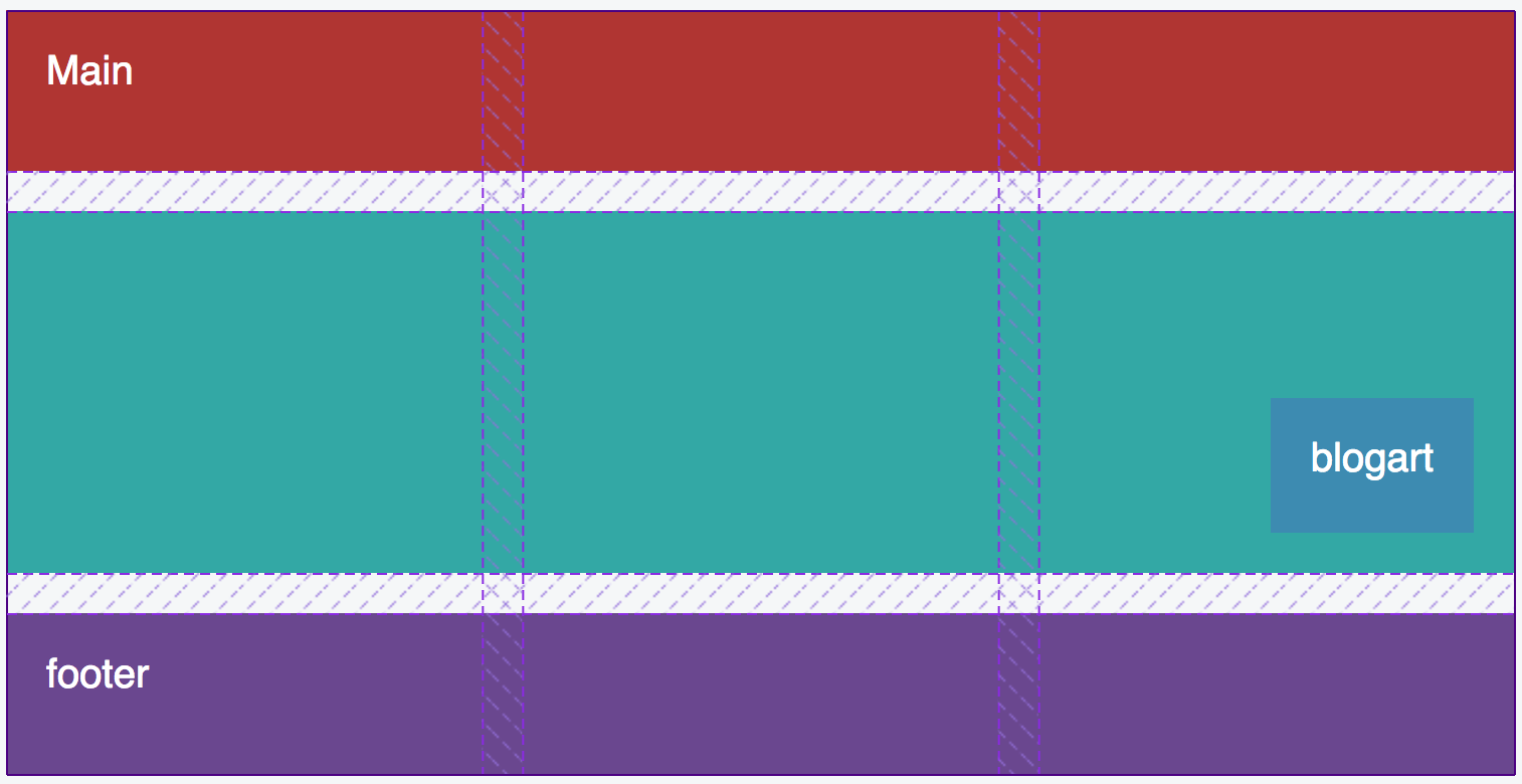
But in the inner grid .main, all the markup is in a fourth column.

I have setup a codepen Greatful for any suggestions.
This is my markup, the css is in the codepen:
body {
  padding-top: 20px;
  background: #f5f7f8;
}

.container{
  display: grid;
  width: 100%;
  max-width: 750px;
  margin: 0 auto;

  grid-template-columns: repeat(3, 1fr);
  grid-template-rows: 80px 180px 80px;
  grid-gap: 20px;

  grid-template-areas: "header   header   header"
                       "main     main     main"
                       "footer   footer   footer";
}

.container div{
  color: white;
  font-size: 20px;
  padding: 20px;
}

.header {
  background: #b03532;
  grid-area: header;
}

.main {
  background: #33a8a5;
  grid-area: main;

  display: grid;

  grid-template-columns: repeat(3, 1fr);
  grid-template-rows: auto;
  grid-gap: 20px;

  grid-template-areas: "bigimg bigimg blogart"
                       "blogart blogart blogart";

}

.bigimg {
  background: #da6f2b;
  grid-area: bigimg;
}

.blogart {
  background: #3d8bb1;
  grid-area: blogart;
}

.footer {
  background: #6a478f;
  grid-area: footer;
}
<section class="container">
<div class="header">Header</div>
<div class="main">
<div class="bigimg">img</div>
<div class="blogart">blogart</div>
<div class="blogart">blogart</div>
<div class="blogart">blogart</div>
<div class="blogart">blogart</div>
</div>
<div class="footer">footer</div>
</section>-Thanks