I would recommend using CSS. For more on how to style a Shiny application with CSS see this article.
I have included a demo application which includes CSS as a string. In practice I would store CSS styles in a separate file, see the article linked above. If you are not familiar with CSS I will briefly summarize the selectors used, more on CSS selectors here.
Summary of CSS selectors,
#my_select_input looks for a tag with id my_select_input~ .selectize-control says we actually want a sibling tag of #my_select_input and that sibling must have the class selectize-control.option says we want child tag(s) of the above tag(s) and those child tag(s) must have the class option- finally, the
:nth-child(odd) and :nth-child(even) let us control which of the child tags are style will apply to, where odd selects the first, third, and fifth (etc.) child and even selects the second, fourth, and sixth (etc.) child.
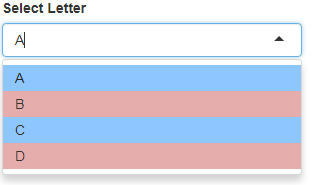
With all that said, here is the demo application.
library(shiny)

shinyApp(
  ui = fluidPage(
    tags$head(
      tags$style("
        #my_select_input ~ .selectize-control .option:nth-child(odd) {
          background-color: rgba(30,144,255,0.5);

        }

        #my_select_input ~ .selectize-control .option:nth-child(even) {
          background-color: rgba(205,92,92,0.5);
        }
        "
      )
    ),
    selectInput(
      inputId = "my_select_input",
      label = "Select Letter",
      choices = c("A", "B", "C", "D")
    )
  ),
  server = function(input, output) {

  }
)
If you wanted to apply the red/blue coloration to all selectize inputs in your application you could drop the #my_select_input ~ prefix. If you wanted to apply a variant of this style to a different selectize input you could change my_select_input and tweak the background color.
