I'm sure I'm missing something here.
Why this 100% width image is bigger than window.screen.width * window.devicePixelRatio
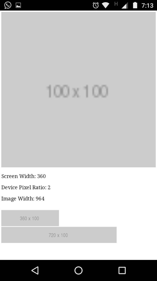
If the screen width equals to 360px and the device ratio is 2
Shouldn't this 100% width image equals to 720px instead of the reported 964px
Fixed Width Images
Also if I put a 720px image it does not cover the full device width???
Note that this is on my real device, a moto g4 play with a 720x1280 screen resolution
EDIT
When I run this code, the reported width if the image is 964px in my case.
This code is also here http://li209-135.members.linode.com/
It should be viewed in a mobile browser.
<!DOCTYPE html>
<html>
<head>
 <title>Test</title>
 <script type="text/javascript" src="//cdnjs.cloudflare.com/ajax/libs/jquery/3.3.1/jquery.js"></script>
 <script>
  $(function(){
    $('#log').append('<p style="font-size:2em;">Screen Width: ' + window.screen.width + '</p>');
    $('#log').append('<p style="font-size:2em;"> Device Pixel Ratio: ' + window.devicePixelRatio + '</p>');
    $('#log').append('<p style="font-size:2em;"> Image Width: ' + $('#test-image').width() + '</p>');
  });
 </script>
</head>
<body>
 <img id="test-image" width="100%" src="http://via.placeholder.com/100x100">
 <div id="log"></div>
 <br>
 <img id="test-image" width="360px" src="http://via.placeholder.com/360x100">
 <br>
 <img id="test-image" width="720px" src="http://via.placeholder.com/720x100">

</body>
</html>