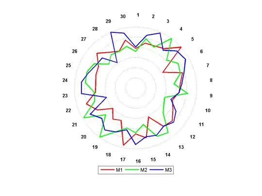
I'm trying to create a two-level sunburst/doughnut diagram (for print) where the second level is a detailed view of the first. I've read and understood this tutorial, but I'm an R and ggplot2 newbie and am having trouble producing the second level. In the aforementioned article, the root level only has one element (which is a bit redundant), whereas my root has many elements; of which, the secondary level has at least 1 and up to 10 elements.
Let's say my data has three columns: name, type and value; where name and type define the root and second level elements, respectively. Each name has exactly one type of all, which is the summation of the values across over types (of which, there's at least one and, across names the sets of type may intersect or be mutually exclusive). For example:
name  type    value
----- ------- ------
foo   all     444
foo   type1   123
foo   type2   321
bar   all     111
bar   type3   111
baz   all     999
baz   type1   456
baz   type3   543
I can create the root level stack (before being converted to polar coordinates) using:
data.all <- data[data$type == "all",]
ggplot(data.all, aes(x=1, y=data.all$value, fill=data.all$name)) + geom_bar(stat="identity")
What I need for the second level stack is for the type values to align within the name values, proportional to their value:
 +-----+  +-------+
 |     |  | type3 |
 | baz |  +-------+
 |     |  | type1 |
 +-----+  +-------+
 |     |  |       |
 | bar |  | type3 |
 |     |  |       |
 +-----+  +-------+
 |     |  | type2 |
 | foo |  +-------+
 |     |  | type1 |
-+-----+--+-------+-
(n.b., this is obviously not to scale!)
I also need the type values to be coloured consistently (e.g., the colour of the type1 block should be the same for both foo and baz, etc.)
I thought I could do this by combining the name and type columns into a new column and then colouring by this:
data.other <- data[data$type != "other",]
data.other$comb <- paste(data.other$name, data.other$type, sep=":")
ggplot(data.other, aes(x=2, y=data.other$value, fill=data.other$comb)) + geom_bar(stat="identity")
However, this breaks the colouring consistency -- obviously, in hindsight -- and, anecdotally, I have absolutely no faith that the alignment will be correct.
My R/ggplot2 nativity is probably pretty apparent (sorry!); how can I achieve what I'm looking for?
EDIT I also came across this question and answer, however my data looks different to theirs. If my data can be munged into the same shape -- which I don't know how to do -- then my question becomes a special case of theirs.


