This is similar to this question here but slightly different.
I want to re-order three divs on mobile and have them side-by-side on desktop. See the attached pictures of the desired results:
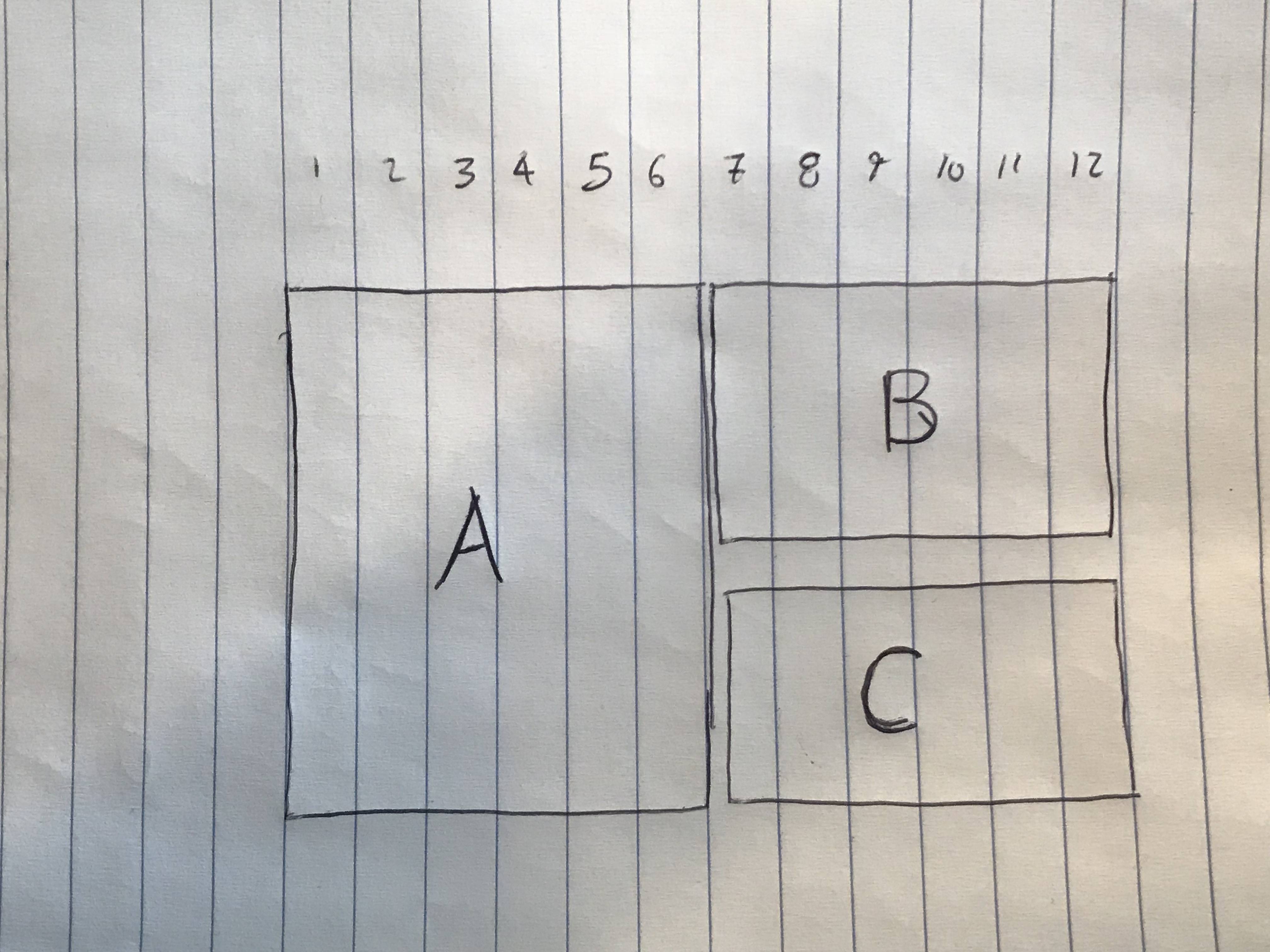
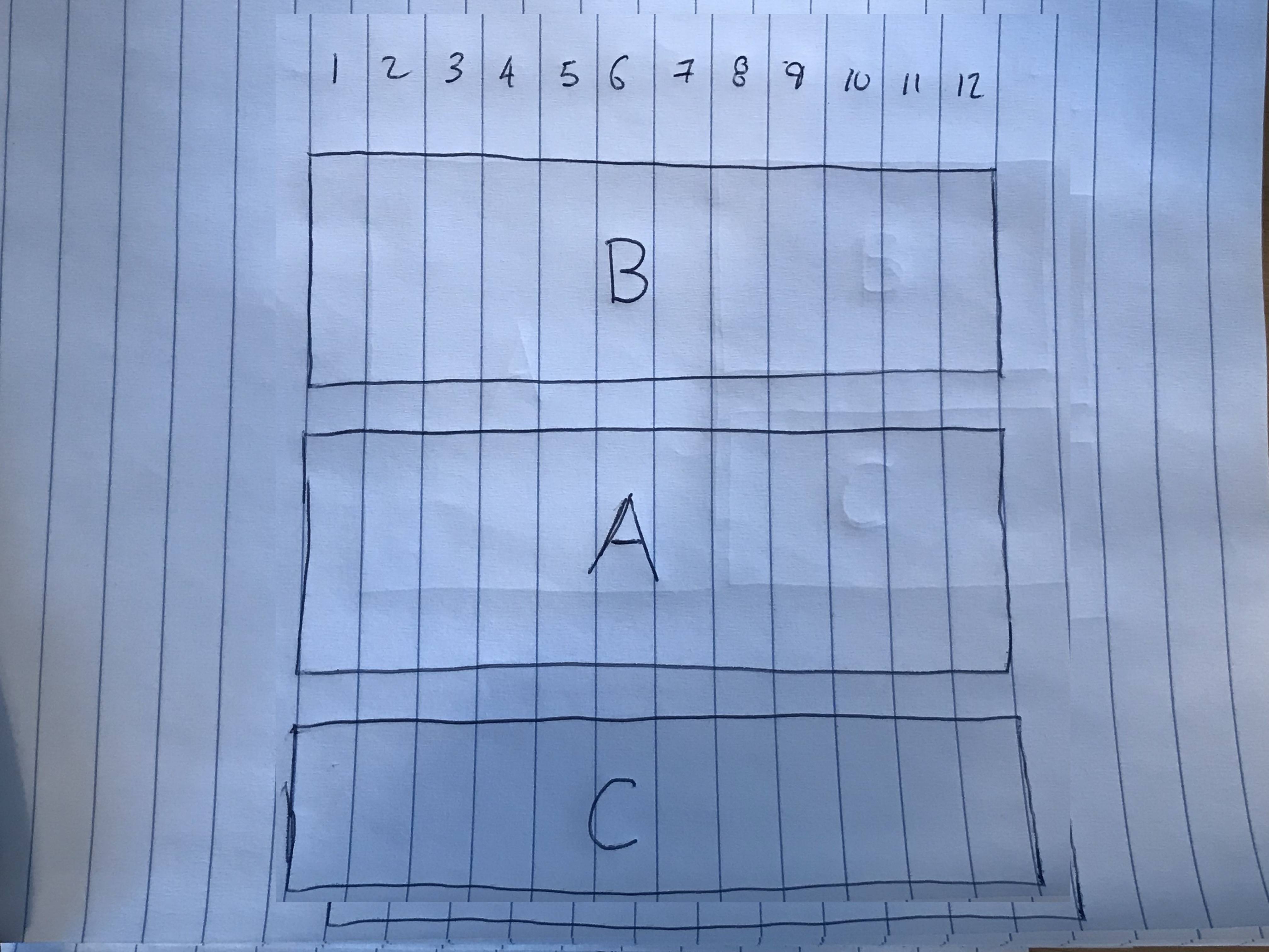
I was having a lot of trouble describing this so I hope the pictures help!
EDIT: Here is a code snippet that works by duplicating code:
const Main = () => (
<section className="" id="section-2">
      <div className="container">
        <div className="row">
          <div className="col-12 d-md-none">
            <div className="text-center">
              <span className="text-uppercase small-text small-text--lighter">step 2</span>
            </div>
            <div className="text-center">
              <h2 className="text-center">HEADER 2</h2>
            </div>
          </div>
          <div className="col-12 col-md-6">
            <img alt="tbd" src="http://www.pixedelic.com/themes/geode/demo/wp-content/uploads/sites/4/2014/04/placeholder4.png" />
          </div>
          <div className="col-12 col-md-5 offset-md-1 text-center text-md-left">
            <div className="d-flex flex-column justify-content-between align-items-center align-items-md-start">
              <div className="d-none d-md-block">
                <span className="text-uppercase small-text small-text--lighter">step 2</span>
              </div>
              <div className="d-none d-md-block">
                <h2 className="">HEADER 2</h2>
              </div>
              <div>
                <p>SOME PARAGRAPH TEXT</p>
              </div>
            </div>
          </div>
        </div>
      </div>
    </section>
)
ReactDOM.render(
  <Main />,
  document.getElementById("react")
);
img {
height: auto;
width: 100%;
}<link href="https://maxcdn.bootstrapcdn.com/bootstrap/4.0.0/css/bootstrap.min.css" rel="stylesheet"/>
<div id="react"></div>
<script src="https://cdnjs.cloudflare.com/ajax/libs/react/15.1.0/react.min.js"></script>
<script src="https://cdnjs.cloudflare.com/ajax/libs/react/15.1.0/react-dom.min.js"></script>