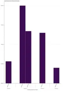
I'm trying to create vbar graph like from bokeh documentation on graph :mean MPG by #cylinders and manufacturer (https://docs.bokeh.org/en/latest/docs/user_guide/categorical.html#userguide-categorical), but keep getting error (BAD_COLUMN_NAME): Glyph refers to nonexistent column name: value".
Here is my csv file:
 id,name,value,vendorname
 1, contract abc, "2,000,500.00", company x
 2, contract bcd, "1,300,500.00", company y
 3, contract cde, "1,344,000.00", company x
 4, contract def, "400,000.00", company z
 5, contract efg, "566,000.00", company s
and so on....
here is the code:
 from bokeh.io import show, output_file
 from bokeh.palettes import Viridis256
 from bokeh.transform import factor_cmap
 import pandas as pd
 from bokeh.core.properties import value
 from bokeh.models import FactorRange, ColumnDataSource
 from bokeh.palettes import Spectral5
 from bokeh.plotting import figure, show
 from bokeh.embed import components

 df = pd.read_csv('contract.csv')
 group = df.groupby(['vendorname', 'name'])
 index_cmap = factor_cmap('vendorname_name', palette=Viridis256, factors=sorted(df.vendorname.unique()), end=1)
 p = figure(plot_width=1000, plot_height=1500, title="Value Contract by # Contract and Vendor", x_range=group, toolbar_location=None,
       tooltips=[("Value", "@value"), ("vendorname, name", "@vendorname_name")])
 p.vbar(x='vendorname_name', top='value', width=1, source=group, line_color="white", fill_color=index_cmap, )

 p.y_range.start = 0
 p.x_range.range_padding = 0.05
 p.xgrid.grid_line_color = None
 p.xaxis.axis_label = "Contract grouped by # Vendor"
 p.xaxis.major_label_orientation = 1.2
 p.outline_line_color = None
 output_file("contract.html")
 show(p)
