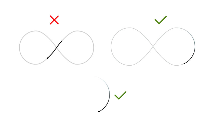
I have created an SVG animation in which I am allowing stroke-dasharray to move. Is it possible that I can add a gradient to the tail of stroke-dasharray and keep one side transparent as you can see in the example?
.svg-main {
    width: 700px;
    margin: 30px auto;
    position: relative;
}
svg#svga {
    position: absolute;
    top: 0;
    left: auto;
    bottom: auto;
    right: auto;
}

.st2{fill:none;stroke:#cccccc;stroke-width:6;}
.sd1{fill:none;stroke:#000000; stroke-width:6;stroke-linecap:round;}
.circ{fill:#000000; }
<div class="svg-main">
<svg id="svga" xmlns="http://www.w3.org/2000/svg" xmlns:xlink="http://www.w3.org/1999/xlink"
width="300px" height="200px" viewBox="0 0 685 310">
<g class="st2">
<path id="loop-normal" d="M343.6,156.5c11,15.9,104.6,147.2,181.9,147.6c0.1,0,0.8,0,1,0c82.1-0.3,148.6-67,148.6-149.2
c0-82.4-66.8-149.2-149.2-149.2c-77.2,0-170.8,131-182.2,147.5c-0.8,1.1-1.6,2.3-2.1,3.1c-10.6,15.3-104.8,147.8-182.4,147.8
C76.7,304.2,9.9,237.4,9.9,155S76.7,5.8,159.1,5.8c77.2,0,170.7,130.9,182.2,147.5C342.1,154.4,342.9,155.6,343.6,156.5z"/>
</g>
<use class="sd1" stroke-dasharray="200 1710" xlink:href="#loop-normal">
<animate attributeName="stroke-dashoffset"
from="200" to="-1710"
begin="0s" dur="10s"
repeatCount="indefinite"/>
</use>
<circle id="plug" class="circ" cx="0" cy="0" r="7"/>
<animateMotion
xlink:href="#plug"
dur="10s"
rotate="auto"
repeatCount="indefinite"
calcMode="linear"
keyTimes="0;1"
keyPoints="0;1">
<mpath xlink:href="#loop-normal"/>
</animateMotion>
</svg>
</div>