Consider this simple example
library(tidyverse)
tibble(x = as.factor(c('good', 'neutral', 'bad')),
       y = as.factor(c('bad', 'neutral', 'bad'))) %>%
  ggplot(aes(x = x, y = y)) + geom_point()
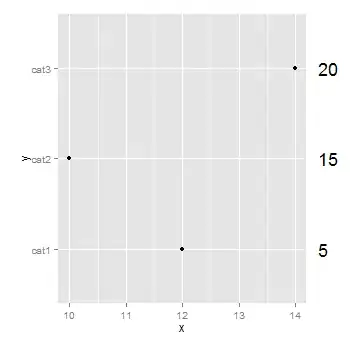
I would like to put the x labels (good, neutral, bad) in different colored boxes. For instance, good (on both the x and y axis) would be surrounded on a small green box, and so on.
Can I do that in ggplot2?
