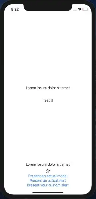
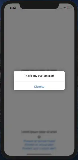
You can have a ZStack with a view that is conditionally displayed depending on a @State variable. The variable will also determine the .blur amount on the underlying view and whether or not a transparent gray view is displayed in between (which makes the background look grayed out). I made an example to illustrate:
struct ContentView: View {
    @State var modalIsPresented = false
    @State var alertIsPresented = false
    @State var customAlertIsPresented = false
    var body: some View {
        ZStack {
            Text("Test!!!")

            VStack {
                Spacer()
                Text("Lorem ipsum dolor sit amet")
                Spacer()
                Text("Lorem ipsum dolor sit amet")
                Image(systemName: "star")
                Button(action: {
                    self.modalIsPresented = true
                }) {
                    Text("Present an actual modal")
                }
                Button(action: {
                    self.alertIsPresented = true
                }) {
                    Text("Present an actual alert")
                }
                Button(action: {
                    withAnimation {
                        self.customAlertIsPresented = true
                    }
                }) {
                    Text("Present your custom alert")
                }
            }
            .blur(radius: self.customAlertIsPresented ? 3 : 0)
            .animation(.easeOut)
            if customAlertIsPresented {
                Rectangle()
                    .background(Color.black)
                    .opacity(0.3)
                    .edgesIgnoringSafeArea(.all)
                    .animation(.easeIn)
            }
            if customAlertIsPresented {
                CustomAlert(isPresented: $customAlertIsPresented).frame(width: 300)
                    .background(Color.white)
                    .animation(.easeIn)
                    .cornerRadius(10)
                    .shadow(radius: 10)
            }
        }.sheet(isPresented: $modalIsPresented) {
            Text("This is what an actual modal looks like")
        }.alert(isPresented: $alertIsPresented) {
            Alert(title: Text("This is what an alert looks like"))
        }
    }
}

struct CustomAlert: View {
    @Binding var isPresented: Bool
    var body: some View {
        VStack {
            Text("This is my custom alert").padding()
            Divider()
            Button(action: {
                self.isPresented = false
            }) {
                HStack {
                    Spacer()
                    Text("Dismiss")
                    Spacer()
                }
            }.padding([.top, .bottom], 10)
        }
    }
}
I added some animations to make the transition smoother. You can adjust things like the .blur, .opacity, and various .animations to customize it took look just the way you want. Here's what my example looks like: