A null-safe and more customizable version of Jay patel's answer below. I've added some behaviour that the current version of the DropdownButton supports, like underline, icon, iconEnabledColor, iconDisabledColor.
import 'dart:math' as math;
import 'package:flutter/material.dart';
const Duration _kDropdownMenuDuration = Duration(milliseconds: 300);
const double _kMenuItemHeight = 48.0;
const double _kDenseButtonHeight = 24.0;
const EdgeInsets _kMenuItemPadding = EdgeInsets.symmetric(horizontal: 16.0);
const EdgeInsetsGeometry _kAlignedButtonPadding =
EdgeInsetsDirectional.only(start: 16.0, end: 4.0);
const EdgeInsets _kUnalignedButtonPadding = EdgeInsets.zero;
const EdgeInsets _kAlignedMenuMargin = EdgeInsets.zero;
const EdgeInsetsGeometry _kUnalignedMenuMargin =
EdgeInsetsDirectional.only(start: 16.0, end: 24.0);
class _DropdownMenuPainter extends CustomPainter {
_DropdownMenuPainter({
required this.color,
required this.elevation,
required this.selectedIndex,
required this.resize,
}) : _painter = BoxDecoration(
// If you add an image here, you must provide a real
// configuration in the paint() function and you must provide some sort
// of onChanged callback here.
color: color,
borderRadius: BorderRadius.circular(2.0),
boxShadow: kElevationToShadow[elevation])
.createBoxPainter(),
super(repaint: resize);
final Color color;
final int elevation;
final int selectedIndex;
final Animation<double> resize;
final BoxPainter _painter;
@override
void paint(Canvas canvas, Size size) {
final double selectedItemOffset =
selectedIndex * _kMenuItemHeight + kMaterialListPadding.top;
final Tween<double> top = Tween<double>(
begin: selectedItemOffset.clamp(0.0, size.height - _kMenuItemHeight),
end: 0.0,
);
final Tween<double> bottom = Tween<double>(
begin: (top.begin ?? 0 + _kMenuItemHeight)
.clamp(_kMenuItemHeight, size.height),
end: size.height,
);
final Rect rect = Rect.fromLTRB(
0.0,
top.evaluate(resize),
size.width,
bottom.evaluate(resize),
);
_painter.paint(
canvas,
rect.topLeft,
ImageConfiguration(size: rect.size),
);
}
@override
bool shouldRepaint(_DropdownMenuPainter oldPainter) {
return oldPainter.color != color ||
oldPainter.elevation != elevation ||
oldPainter.selectedIndex != selectedIndex ||
oldPainter.resize != resize;
}
}
// Do not use the platform-specific default scroll configuration.
// Dropdown menus should never overscroll or display an overscroll indicator.
class _DropdownScrollBehavior extends ScrollBehavior {
const _DropdownScrollBehavior();
@override
TargetPlatform getPlatform(BuildContext context) =>
Theme.of(context).platform;
@override
Widget buildViewportChrome(
BuildContext context, Widget child, AxisDirection axisDirection) =>
child;
@override
ScrollPhysics getScrollPhysics(BuildContext context) =>
const ClampingScrollPhysics();
}
class _DropdownMenu<T> extends StatefulWidget {
const _DropdownMenu({
Key? key,
required this.padding,
required this.route,
}) : super(key: key);
final _DropdownRoute<T> route;
final EdgeInsets padding;
@override
_DropdownMenuState<T> createState() => _DropdownMenuState<T>();
}
class _DropdownMenuState<T> extends State<_DropdownMenu<T>> {
late CurvedAnimation _fadeOpacity;
late CurvedAnimation _resize;
@override
void initState() {
super.initState();
// We need to hold these animations as state because of their curve
// direction. When the route's animation reverses, if we were to recreate
// the CurvedAnimation objects in build, we'd lose
// CurvedAnimation._curveDirection.
_fadeOpacity = CurvedAnimation(
parent: widget.route.animation!,
curve: const Interval(0.0, 0.25),
reverseCurve: const Interval(0.75, 1.0),
);
_resize = CurvedAnimation(
parent: widget.route.animation!,
curve: const Interval(0.25, 0.5),
reverseCurve: const Threshold(0.0),
);
}
@override
Widget build(BuildContext context) {
// The menu is shown in three stages (unit timing in brackets):
// [0s - 0.25s] - Fade in a rect-sized menu container with the selected item.
// [0.25s - 0.5s] - Grow the otherwise empty menu container from the center
// until it's big enough for as many items as we're going to show.
// [0.5s - 1.0s] Fade in the remaining visible items from top to bottom.
//
// When the menu is dismissed we just fade the entire thing out
// in the first 0.25s.
final MaterialLocalizations localizations =
MaterialLocalizations.of(context);
final _DropdownRoute<T> route = widget.route;
final double unit = 0.5 / (route.items.length + 1.5);
final List<Widget> children = <Widget>[];
for (int itemIndex = 0; itemIndex < route.items.length; ++itemIndex) {
CurvedAnimation opacity;
if (itemIndex == route.selectedIndex) {
opacity = CurvedAnimation(
parent: route.animation!,
curve: const Threshold(0.0),
);
} else {
final double start = (0.5 + (itemIndex + 1) * unit).clamp(0.0, 1.0);
final double end = (start + 1.5 * unit).clamp(0.0, 1.0);
opacity = CurvedAnimation(
parent: route.animation!,
curve: Interval(start, end),
);
}
children.add(FadeTransition(
opacity: opacity,
child: InkWell(
onTap: () => Navigator.pop(
context,
_DropdownRouteResult<T>(route.items[itemIndex].value!),
),
child: Container(
padding: widget.padding,
child: route.items[itemIndex],
),
),
));
}
return FadeTransition(
opacity: _fadeOpacity,
child: CustomPaint(
painter: _DropdownMenuPainter(
color: Theme.of(context).canvasColor,
elevation: route.elevation,
selectedIndex: route.selectedIndex,
resize: _resize,
),
child: Semantics(
scopesRoute: true,
namesRoute: true,
explicitChildNodes: true,
label: localizations.popupMenuLabel,
child: Material(
type: MaterialType.transparency,
textStyle: route.style,
child: ScrollConfiguration(
behavior: const _DropdownScrollBehavior(),
child: Scrollbar(
child: ListView(
controller: widget.route.scrollController,
padding: kMaterialListPadding,
itemExtent: _kMenuItemHeight,
shrinkWrap: true,
children: children,
),
),
),
),
),
),
);
}
}
class _DropdownMenuRouteLayout<T> extends SingleChildLayoutDelegate {
_DropdownMenuRouteLayout({
required this.buttonRect,
required this.menuTop,
required this.menuHeight,
required this.textDirection,
});
final Rect buttonRect;
final double menuTop;
final double menuHeight;
final TextDirection textDirection;
@override
BoxConstraints getConstraintsForChild(BoxConstraints constraints) {
// The maximum height of a simple menu should be one or more rows less than
// the view height. This ensures a tappable area outside of the simple menu
// with which to dismiss the menu.
// -- https://material.google.com/components/menus.html#menus-simple-menus
final double maxHeight =
math.max(0.0, constraints.maxHeight - 2 * _kMenuItemHeight);
// The width of a menu should be at most the view width. This ensures that
// the menu does not extend past the left and right edges of the screen.
final double width = math.min(constraints.maxWidth, buttonRect.width);
return BoxConstraints(
minWidth: width,
maxWidth: width,
maxHeight: maxHeight,
);
}
@override
Offset getPositionForChild(Size size, Size childSize) {
assert(() {
final Rect container = Offset.zero & size;
if (container.intersect(buttonRect) == buttonRect) {
// If the button was entirely on-screen, then verify
// that the menu is also on-screen.
// If the button was a bit off-screen, then, oh well.
assert(menuTop >= 0.0);
assert(menuTop + menuHeight <= size.height);
}
return true;
}());
double left;
switch (textDirection) {
case TextDirection.rtl:
left = buttonRect.right.clamp(0.0, size.width) - childSize.width;
break;
case TextDirection.ltr:
left = buttonRect.left.clamp(0.0, size.width - childSize.width);
break;
}
return Offset(left, menuTop);
}
@override
bool shouldRelayout(_DropdownMenuRouteLayout<T> oldDelegate) {
return buttonRect != oldDelegate.buttonRect ||
menuTop != oldDelegate.menuTop ||
menuHeight != oldDelegate.menuHeight ||
textDirection != oldDelegate.textDirection;
}
}
class _DropdownRouteResult<T> {
const _DropdownRouteResult(this.result);
final T result;
@override
bool operator ==(dynamic other) {
if (other is! _DropdownRouteResult<T>) {
return false;
}
final _DropdownRouteResult<T> typedOther = other;
return result == typedOther.result;
}
@override
int get hashCode => result.hashCode;
}
class _DropdownRoute<T> extends PopupRoute<_DropdownRouteResult<T>> {
_DropdownRoute({
required this.items,
required this.padding,
required this.buttonRect,
required this.selectedIndex,
required this.theme,
required this.style,
required this.barrierLabel,
this.elevation = 8,
});
final List<DropdownMenuItem<T>> items;
final EdgeInsetsGeometry padding;
final Rect buttonRect;
final int selectedIndex;
final int elevation;
final ThemeData theme;
final TextStyle style;
ScrollController? scrollController;
@override
Duration get transitionDuration => _kDropdownMenuDuration;
@override
bool get barrierDismissible => true;
@override
Color? get barrierColor => null;
@override
final String barrierLabel;
@override
Widget buildPage(BuildContext context, Animation<double> animation,
Animation<double> secondaryAnimation) {
assert(debugCheckHasDirectionality(context));
final double screenHeight = MediaQuery.of(context).size.height;
final double maxMenuHeight = screenHeight - 2.0 * _kMenuItemHeight;
final double preferredMenuHeight =
(items.length * _kMenuItemHeight) + kMaterialListPadding.vertical;
final double menuHeight = math.min(maxMenuHeight, preferredMenuHeight);
final double buttonTop = buttonRect.top;
final double selectedItemOffset =
selectedIndex * _kMenuItemHeight + kMaterialListPadding.top;
double menuTop = (buttonTop - selectedItemOffset) -
(_kMenuItemHeight - buttonRect.height) / 2.0;
const double topPreferredLimit = _kMenuItemHeight;
if (menuTop < topPreferredLimit) {
menuTop = math.min(buttonTop, topPreferredLimit);
}
double bottom = menuTop + menuHeight;
final double bottomPreferredLimit = screenHeight - _kMenuItemHeight;
if (bottom > bottomPreferredLimit) {
bottom = math.max(buttonTop + _kMenuItemHeight, bottomPreferredLimit);
menuTop = bottom - menuHeight;
}
if (scrollController == null) {
double scrollOffset = 0.0;
if (preferredMenuHeight > maxMenuHeight) {
scrollOffset = selectedItemOffset - (buttonTop - menuTop);
}
scrollController = ScrollController(initialScrollOffset: scrollOffset);
}
final TextDirection textDirection = Directionality.of(context);
Widget menu = _DropdownMenu<T>(
route: this,
padding: padding.resolve(textDirection),
);
menu = Theme(data: theme, child: menu);
return MediaQuery.removePadding(
context: context,
removeTop: true,
removeBottom: true,
removeLeft: true,
removeRight: true,
child: Builder(
builder: (BuildContext context) {
return CustomSingleChildLayout(
delegate: _DropdownMenuRouteLayout<T>(
buttonRect: buttonRect,
menuTop: menuTop,
menuHeight: menuHeight,
textDirection: textDirection,
),
child: menu,
);
},
),
);
}
void _dismiss() {
navigator?.removeRoute(this);
}
}
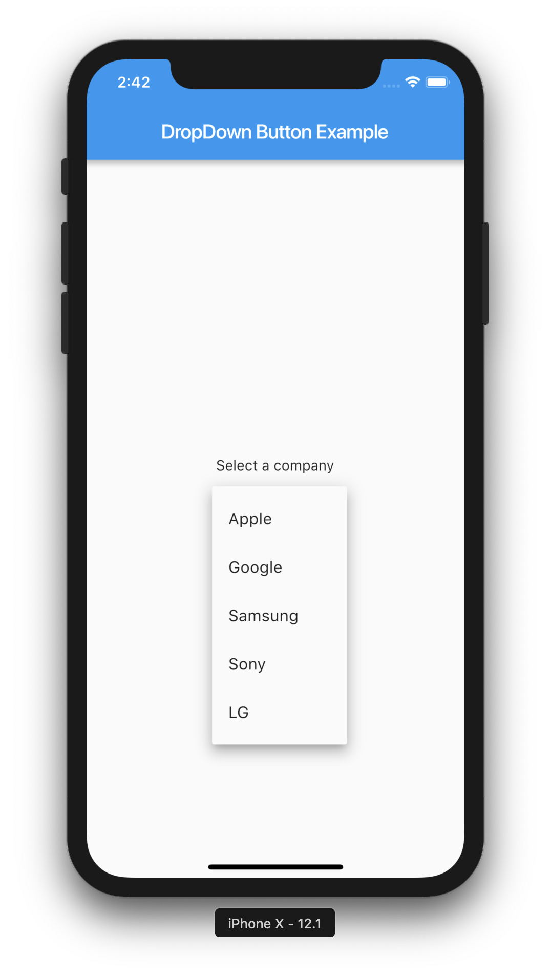
class CustomDropdownButton<T> extends StatefulWidget {
/// Creates a dropdown button.
///
/// The [items] must have distinct values and if [value] isn't null it must be among them.
///
/// The [elevation] and [iconSize] arguments must not be null (they both have
/// defaults, so do not need to be specified).
CustomDropdownButton({
Key? key,
required this.items,
this.hint,
this.onChanged,
this.style,
this.elevation = 8,
this.icon,
this.iconDisabledColor,
this.iconEnabledColor,
this.iconSize = 24.0,
this.isDense = false,
this.underline,
this.value,
this.dropdownColor,
}) : assert(value == null ||
items
.where((DropdownMenuItem<T> item) => item.value == value)
.length ==
1),
super(key: key);
/// The list of possible items to select among.
final List<DropdownMenuItem<T>> items;
/// The currently selected item, or null if no item has been selected. If
/// value is null then the menu is popped up as if the first item was
/// selected.
final T? value;
/// Displayed if [value] is null.
final Widget? hint;
/// Custom underline Widget, allowing you to change the default
final Widget? underline;
/// Called when the user selects an item.
final ValueChanged<T>? onChanged;
/// The z-coordinate at which to place the menu when open.
///
/// The following elevations have defined shadows: 1, 2, 3, 4, 6, 8, 9, 12, 16, 24
///
/// Defaults to 8, the appropriate elevation for dropdown buttons.
final int elevation;
/// The text style to use for text in the dropdown button and the dropdown
/// menu that appears when you tap the button.
///
/// Defaults to the [TextTheme.subhead] value of the current
/// [ThemeData.textTheme] of the current [Theme].
final TextStyle? style;
/// The widget to use for the drop-down button's icon.
///
/// Defaults to an [Icon] with the [Icons.arrow_drop_down] glyph.
final Widget? icon;
final Color? dropdownColor;
/// The color of any [Icon] descendant of [icon] if this button is disabled,
/// i.e. if [onChanged] is null.
///
/// Defaults to [MaterialColor.shade400] of [Colors.grey] when the theme's
/// [ThemeData.brightness] is [Brightness.light] and to
/// [Colors.white10] when it is [Brightness.dark]
final Color? iconDisabledColor;
/// The color of any [Icon] descendant of [icon] if this button is enabled,
/// i.e. if [onChanged] is defined.
///
/// Defaults to [MaterialColor.shade700] of [Colors.grey] when the theme's
/// [ThemeData.brightness] is [Brightness.light] and to
/// [Colors.white70] when it is [Brightness.dark]
final Color? iconEnabledColor;
/// The size to use for the drop-down button's down arrow icon button.
///
/// Defaults to 24.0.
final double iconSize;
/// Reduce the button's height.
///
/// By default this button's height is the same as its menu items' heights.
/// If isDense is true, the button's height is reduced by about half. This
/// can be useful when the button is embedded in a container that adds
/// its own decorations, like [InputDecorator].
final bool isDense;
@override
_DropdownButtonState<T> createState() => _DropdownButtonState<T>();
}
class _DropdownButtonState<T> extends State<CustomDropdownButton<T>>
with WidgetsBindingObserver {
int? _selectedIndex;
_DropdownRoute<T>? _dropdownRoute;
@override
void initState() {
super.initState();
/// Comment line below out if you don't want your dropdown to have an initial
/// value upon initial build
_updateSelectedIndex();
WidgetsBinding.instance!.addObserver(this);
}
@override
void dispose() {
WidgetsBinding.instance!.removeObserver(this);
_removeDropdownRoute();
super.dispose();
}
// Typically called because the device's orientation has changed.
// Defined by WidgetsBindingObserver
@override
void didChangeMetrics() {
_removeDropdownRoute();
}
void _removeDropdownRoute() {
_dropdownRoute?._dismiss();
_dropdownRoute = null;
}
@override
void didUpdateWidget(CustomDropdownButton<T> oldWidget) {
super.didUpdateWidget(oldWidget);
_updateSelectedIndex();
}
void _updateSelectedIndex() {
assert(widget.value == null ||
widget.items
.where((DropdownMenuItem<T> item) => item.value == widget.value)
.length ==
1);
_selectedIndex = 0;
for (int itemIndex = 0; itemIndex < widget.items.length; itemIndex++) {
if (widget.items[itemIndex].value == widget.value) {
_selectedIndex = itemIndex;
return;
}
}
}
TextStyle get _textStyle =>
widget.style ?? Theme.of(context).textTheme.subtitle1!;
void _handleTap() {
final RenderBox itemBox = context.findRenderObject()! as RenderBox;
final Rect itemRect = itemBox.localToGlobal(Offset.zero) & itemBox.size;
final TextDirection textDirection = Directionality.of(context);
final EdgeInsetsGeometry menuMargin =
ButtonTheme.of(context).alignedDropdown
? _kAlignedMenuMargin
: _kUnalignedMenuMargin;
assert(_dropdownRoute == null);
_dropdownRoute = _DropdownRoute<T>(
items: widget.items,
buttonRect: menuMargin.resolve(textDirection).inflateRect(itemRect),
padding: _kMenuItemPadding.resolve(textDirection),
selectedIndex: -1,
elevation: widget.elevation,
theme: Theme.of(context),
style: _textStyle,
barrierLabel: MaterialLocalizations.of(context).modalBarrierDismissLabel,
);
Navigator.push(context, _dropdownRoute!)
.then<void>((_DropdownRouteResult<T>? newValue) {
_dropdownRoute = null;
if (!mounted || newValue == null) {
return;
}
if (widget.onChanged != null) {
widget.onChanged!(newValue.result);
}
});
}
// When isDense is true, reduce the height of this button from _kMenuItemHeight to
// _kDenseButtonHeight, but don't make it smaller than the text that it contains.
// Similarly, we don't reduce the height of the button so much that its icon
// would be clipped.
double get _denseButtonHeight {
return math.max(
_textStyle.fontSize!, math.max(widget.iconSize, _kDenseButtonHeight));
}
@override
Widget build(BuildContext context) {
assert(debugCheckHasMaterial(context));
// The width of the button and the menu are defined by the widest
// item and the width of the hint.
final List<Widget> items = List<Widget>.from(widget.items);
int? hintIndex;
if (widget.hint != null) {
hintIndex = items.length;
items.add(DefaultTextStyle(
style: _textStyle.copyWith(
color: Theme.of(context).hintColor,
),
child: IgnorePointer(
ignoringSemantics: false,
child: widget.hint,
),
));
}
final EdgeInsetsGeometry padding = ButtonTheme.of(context).alignedDropdown
? _kAlignedButtonPadding
: _kUnalignedButtonPadding;
Widget result = DefaultTextStyle(
style: _textStyle,
child: Container(
padding: padding.resolve(Directionality.of(context)),
height: widget.isDense ? _denseButtonHeight : null,
child: Row(
mainAxisAlignment: MainAxisAlignment.spaceBetween,
mainAxisSize: MainAxisSize.min,
children: <Widget>[
// If value is null (then _selectedIndex is null) then we display
// the hint or nothing at all.
IndexedStack(
index: _selectedIndex ?? hintIndex,
alignment: AlignmentDirectional.centerStart,
children: items,
),
IconTheme(
data: IconThemeData(
color: Theme.of(context).brightness == Brightness.light
? Colors.grey.shade700
: Colors.white70,
size: widget.iconSize,
),
child: widget.icon ?? const Icon(Icons.arrow_drop_down),
),
],
),
),
);
if (!DropdownButtonHideUnderline.at(context)) {
final double bottom = widget.isDense ? 0.0 : 8.0;
result = Stack(
children: <Widget>[
result,
Positioned(
left: 0.0,
right: 0.0,
bottom: bottom,
child: widget.underline ??
Container(
height: 1.0,
decoration: const BoxDecoration(
border: Border(
bottom: BorderSide(
color: Color(0xFFBDBDBD), width: 0.0))),
),
),
],
);
}
return Semantics(
button: true,
child: GestureDetector(
onTap: _handleTap,
behavior: HitTestBehavior.opaque,
child: result,
),
);
}
}