I have three items that I would like to layout in 2 columns.
Item 1 is taller than Item 2 and 3.
Here is my css.
<div class="container">
    <div class="item1">hi there</div>
    <div class="item2">hi there</div>
    <div class="item3">hi there</div>
</div>
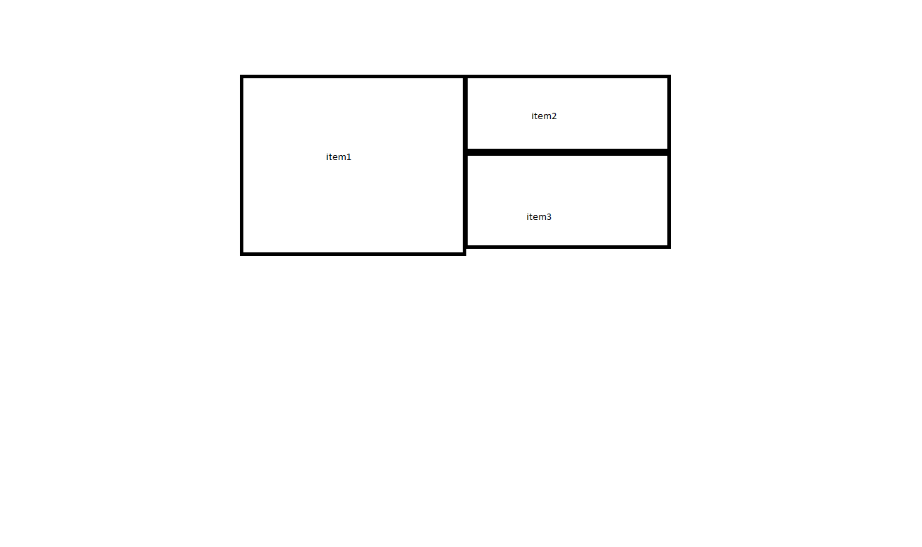
I'm trying to get it to look like this:
Here is what I've tried:
try 1:
.container {
    display:flex;
}
Makes 3 columns, lined up in 1 row.
try 2:
.container {
    display:flex;
    flex-wrap: wrap;
}
This makes the layout look like this:

try 3:
.container {
    display: grid;
    grid-auto-flow: column;
    grid-template-areas: "1 2" "1 3";
}

.item1 {
    grid-area: 1;
}

.item2 {
    grid-area: 2;
}

.item3 {
    grid-area: 1;
}
this doesn't seem to work as everything stacks up on itself in a single column.