My container component looks like this:
<Container className="contact-content debug-border">
    <Row className="justify-content-center">
        <Col md={2} className="text-center text-md-right">
            Phone:
        </Col>
        <Col md={3} className="text-center text-md-left">
            XXXXXXXXX
        </Col>
    </Row>
    <Row className="justify-content-center">
        <Col md={2} className="text-center text-md-right">
            Email-ID:
        </Col>
        <Col md={3} className="text-center text-md-left">
            XXXXXXXXXXX
        </Col>
    </Row>
</Container>
My CSS is as follows:
.contact-content{
    height: 83vh;
}

.debug-border{
    border: 2px;
    border-style: dashed;
}
What it looks like is this:
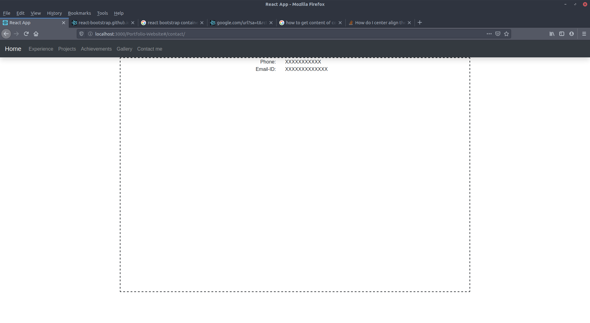 What I want is the row and columns with the phone and email data to be shown in the middle of page
What I tried out:
I tried to add classes to the container:
- align-content-center
- align-items-center
- align-content-middle
- align-items-middle
- align-middle
- my-auto
- py-auto
It brings no difference to the look of the webpage.
I added padding:40vh to the contact-content css class and it worked but I want to know if there is any class in bootstrap that will align the rows and columns inside of the container to the middle of the page.