I have a dataset which looks like the following:
my_DataSet <- {
| # | Variable A | Variable B | Variable C | Control Group |
|---|---|---|---|---|
| 1 | 1 | 0 | 0 | 1 |
| 2 | 1 | 1 | 0 | 1 |
| 3 | 0 | 0 | 1 | 0 |
}
Following Plot multiple boxplot in one graph, I did a transformation (new_DataSet <- melt(my_DataSet, id.var = "Control_Group")) so that the resulting data looks like this:
I have a dataset which looks like the following:
new_DataSet <- {
| # | Control Group | variable | value |
|---|---|---|---|
| 1 | 1 | Variable A | 1 |
| 2 | 1 | Variable B | 0 |
| 3 | 1 | Variable C | 0 |
| 4 | 1 | Variable A | 1 |
| 5 | 1 | Variable B | 1 |
| 6 | 1 | Variable C | 0 |
| 7 | 0 | Variable A | 0 |
| 8 | 0 | Variable B | 0 |
| 9 | 0 | Variable C | 1 |
}
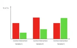
I want to produce a bar graph which shows the percentage of 1s in the control and intervention group along all 3 variables.
I imagine something like the following bar graph:
What I have done is the following:
p <- ggplot(data = my_DataSet)
p + geom_bar(mapping = aes(x = Variable_A, y = ..prop.., fill = Control_Group), position = "dodge")
This results in:
Which has two issues
- It only displays
Variable A, notA,BandC - I only want the percentage for the 1s, not for the zeroes. If I filter my data beforehand, the proportion becomes wrong, however.

