I am currently plotting temporal scatter plot using the following data (you can use these data to reproduce my plot). Data to be plotted in x-axis is time, specifically datetime.datetime object (tp_pass) while data to be plotted in y-axis is angle between -180 and 180 (azip_pass). Also, they are both numpy.array.
tp_pass=np.array([datetime.datetime(2019, 10, 29, 1, 4, 43),
        datetime.datetime(2019, 10, 31, 1, 11, 19),
        datetime.datetime(2019, 11, 20, 8, 26, 7),
        datetime.datetime(2019, 11, 20, 23, 50, 43),
        datetime.datetime(2019, 12, 10, 17, 5, 2),
        datetime.datetime(2020, 1, 2, 18, 23, 53),
        datetime.datetime(2020, 2, 13, 10, 33, 44),
        datetime.datetime(2020, 2, 20, 18, 57, 36),
        datetime.datetime(2020, 3, 25, 2, 49, 20),
        datetime.datetime(2020, 4, 10, 16, 44, 56),
        datetime.datetime(2020, 4, 18, 8, 25, 37),
        datetime.datetime(2020, 4, 19, 20, 39, 5),
        datetime.datetime(2020, 5, 3, 11, 54, 24),
        datetime.datetime(2020, 5, 4, 13, 7, 48),
        datetime.datetime(2020, 5, 30, 18, 13, 47),
        datetime.datetime(2020, 6, 13, 15, 51, 24),
        datetime.datetime(2020, 6, 24, 19, 47, 44),
        datetime.datetime(2020, 7, 30, 0, 35, 56),
        datetime.datetime(2020, 8, 1, 17, 9, 1),
        datetime.datetime(2020, 8, 3, 8, 31, 10),
        datetime.datetime(2020, 8, 18, 0, 3, 48),
        datetime.datetime(2020, 9, 15, 3, 41, 28),
        datetime.datetime(2020, 9, 20, 22, 13, 15),
        datetime.datetime(2020, 10, 3, 9, 31, 31),
        datetime.datetime(2020, 11, 6, 8, 56, 38),
        datetime.datetime(2020, 11, 15, 22, 37, 43),
        datetime.datetime(2020, 12, 10, 13, 19, 58),
        datetime.datetime(2020, 12, 20, 17, 23, 22),
        datetime.datetime(2020, 12, 24, 23, 43, 41),
        datetime.datetime(2021, 1, 12, 2, 39, 43),
        datetime.datetime(2021, 2, 13, 14, 7, 50),
        datetime.datetime(2021, 3, 2, 21, 22, 46)], dtype=object)

azip_pass=np.array([168.3472527 ,  160.09844756,  175.44976695,  159.46139347,
          168.4780719 ,  165.17699028,  158.22654417,  151.02735996,
          159.39235045,  164.8792118 ,  168.84217025,  166.09269395,
          -179.97929963,  163.3389004 ,  167.24285926,  167.08062597,
          163.71540408,  171.13687447,  163.61945117,  172.68473083,
          159.89871931,  166.72228462,  162.2774924 ,  166.13812415,
          14.7128006 ,   12.43499853,   11.86328998,   10.56097159,
          16.16589956,   12.81530251,   10.0220719 ,   4.21173499])
Using the following Python script, I generated the plot.
import matplotlib.pyplot as plt
import numpy as np
import datetime
from matplotlib import dates
from matplotlib import rc
%config InlineBackend.print_figure_kwargs={'facecolor' : "w"}
rc('axes', edgecolor='k', linewidth="5.0")

fig, ax=plt.subplots(1, 1, figsize=(30, 10))
ax.xaxis.set_major_locator(dates.YearLocator())
ax.set_ylim(-185, 185)
ax.scatter(tp_pass, azip_pass, color="b", s=200, alpha=1.0, ec="k")
plt.xticks(fontsize=35)
plt.yticks([-180, -120, -60, 0, 60, 120, 180], ["${}^\circ$".format(x) for x in [-180, -120, -60, 0, 60, 120, 180]], fontsize=35)
plt.tight_layout()
plt.show()
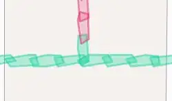
x-axis of the plot automatically marks the year since I used matplotlib.dates.YearLocator(). Actually, I am not really satisfied with it and want to also locate months between years. However, I want months to be shown by their names, not numbers (ex. Jan, Feb, Mar, etc.). The x-axis of figure below shows what I want to implement. Is this possible using matplotlib?
Added (2021-05-18)
Using matplotlib.dates.MonthLocator(), I was able to make months show. However, the year number disappeared. Is there a way to show both year and months together (ex. year beneath month) using matplotlib?
fig, ax=plt.subplots(1, 1, figsize=(30, 10))
ax.xaxis.set_major_locator(dates.YearLocator()) # This line does not work
ax.xaxis.set_major_locator(dates.MonthLocator(bymonthday=15))
ax.xaxis.set_major_formatter(dates.DateFormatter('%b'))
ax.set_ylim(-185, 185)
ax.scatter(tp_pass, azip_pass, color="b", s=200, alpha=1.0, ec="k")
plt.xticks(fontsize=35)
plt.yticks([-180, -120, -60, 0, 60, 120, 180], ["${}^\circ$".format(x) for x in [-180, -120, -60, 0, 60, 120, 180]], fontsize=35)
plt.tight_layout()
plt.show()
Added (2021-05-19)
I found answer by Patrick FitzGerald to this question How to change the datetime tick label frequency for matplotlib plots? very helpful. This answer does not require the usage of secondary x-axis and does what I wanted to do.


