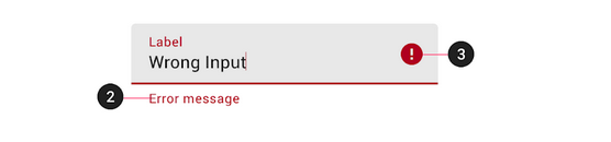
Here is a ready to use composable that you can copy paste into your code. It has a String field called errorthat will display the error whenever it is not empty (that way you only have one state variable to keep track of). It is a bit verbose so you are able to customize it as you would any OutlinedTextField.
sample usage
OutlinedTextFieldValidation(
        value = studentState.firstName.value,
        onValueChange = { onFirstNameChange(it) },
        label = { Text(text = "First name") },
        error = "field cannot be empty"
    )
code to copy:
@Composable
fun OutlinedTextFieldValidation(
    value: String,
    onValueChange: (String) -> Unit,
    modifier: Modifier = Modifier.fillMaxWidth(0.8f),
    enabled: Boolean = true,
    readOnly: Boolean = false,
    textStyle: TextStyle = LocalTextStyle.current,
    label: @Composable (() -> Unit)? = null,
    placeholder: @Composable (() -> Unit)? = null,
    leadingIcon: @Composable (() -> Unit)? = null,
    error: String = "",
    isError: Boolean = error.isNotEmpty(),
    trailingIcon: @Composable (() -> Unit)? = {
        if (error.isNotEmpty())
            Icon(Icons.Filled.Error, "error", tint = MaterialTheme.colors.error)
    },
    visualTransformation: VisualTransformation = VisualTransformation.None,
    keyboardOptions: KeyboardOptions = KeyboardOptions.Default,
    keyboardActions: KeyboardActions = KeyboardActions.Default,
    singleLine: Boolean = true,
    maxLines: Int = Int.MAX_VALUE,
    interactionSource: MutableInteractionSource = remember { MutableInteractionSource() },
    shape: Shape = MaterialTheme.shapes.small,
    colors: TextFieldColors = TextFieldDefaults.outlinedTextFieldColors(
        disabledTextColor = Color.Black
    )

) {

    Column(modifier = modifier
        .padding(8.dp)) {
        OutlinedTextField(
            enabled = enabled,
            readOnly = readOnly,
            value = value,
            onValueChange = onValueChange,
            modifier = Modifier
                .fillMaxWidth(),
            singleLine = singleLine,
            textStyle = textStyle,
            label = label,
            placeholder = placeholder,
            leadingIcon = leadingIcon,
            trailingIcon = trailingIcon,
            isError = isError,
            visualTransformation = visualTransformation,
            keyboardOptions = keyboardOptions,
            keyboardActions = keyboardActions,
            maxLines = maxLines,
            interactionSource = interactionSource,
            shape = shape,
            colors = colors
        )
        if (error.isNotEmpty()) {
            Text(
                text = error,
                color = MaterialTheme.colors.error,
                style = MaterialTheme.typography.caption,
                modifier = Modifier.padding(start = 16.dp, top = 0.dp)
            )
        }
    }
}


