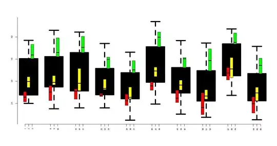
I have a problem with my dataset and I would like to create a histogram showing the distribution of observations per quarter. The observations are divided into 3 categories and should be displayed per quarter. Unfortunately, I have not yet found out how it works. With a "normal" plot I have added the respective observation points via the command "points", but I don't quite know how this works with histograms. Any help is greatly appreciated!
This is a sample of my data (in real there are about 20 years of observations with its categories):
            date    n           Categorie1 Categorie2 Categorie3
         2015 Q1    67                5          2          1
         2015 Q2    71                3          4          2
         2015 Q3    69                2         10         11
         2015 Q4    62                1          0          0
         2016 Q1    69                2          2          1
         2016 Q2    61                3          5          0
         2016 Q3    63                3          2          7
The variable "date" is in the format 'yearqtr'.
I have used the following code to produce the normal plot:
> plot(df23$date,df23$Categorie1 , col = "red", pch = 16, xlab="Quarter",
> ylab="Occurencies")
>     points(df23$date,df23$Categorie2 , col = "blue", pch = 16)
>     points(df23$date,df23$Categorie3 , col = "green", pch = 16)
So I get a graph, but I don't know how to get this histogram for the different categories per quarter.
Can you please help me to create the histogram for the different categories and the different quarters?
Many thanks in advance!
This is my dput(df23):
>  dput(df23)
structure(list(date = structure(c(2015, 2015.25, 2015.5, 2015.75,
2016, 2016.25, 2016.5), class = "yearqtr"), n = c(67, 71, 69,
62, 69, 61, 63), Categorie1 = c(5, 3, 2, 1, 2, 3, 3), Categorie2 = c(2,
4, 10, 0, 2, 5, 2), Categorie3 = c(1, 2, 11, 0, 1, 0, 7)), row.names = c(NA,
7L), class = "data.frame")

