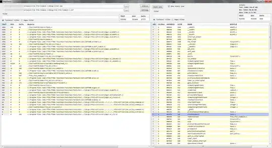
I want to make sure this output's x-axis is readable or make it bigger. I have tried coord_flip and did not work
electric_cons %>%
  group_by(day_of_week, Hour) %>%
  summarise(AvgUnits = mean(Unit)) %>%
  ggplot() +
  geom_bar(aes(x = Hour, y = AvgUnits, fill = AvgUnits), stat = "identity") +
  facet_wrap(.~day_of_week) +
  theme(axis.text.x = element_text(angle=90, vjust=1, hjust=1)) +
  ggtitle("Average Consumption of electricity during a day", subtitle = "Consumption recorded in every 30 minutes - Weekly ") +
  xlab("Time") +
  ylab("Average units consumed")
