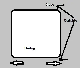
I got an background-image of a big white square, and now I'm trying to keep a div positioned in the corner of that square, but when I resize the page, that div don't follow that corner. I suppose that occur because of the background-size: cover;, since that condition keep zooming in/out when resized.
I also would like to keep that square in the proportion of the white square.
background-image and div in normal size:

resized background-image and div:

I'm already using position absolute and relative.
I've been trying to use only flexible values (vh/vw, %)
Full code:
<!DOCTYPE html>
<html lang="en">
  <head>
    <meta charset="UTF-8" />
    <meta http-equiv="X-UA-Compatible" content="IE=edge" />
    <meta name="viewport" content="width=device-width, initial-scale=1.0" />
    <title>Document</title>

    <style>
      .bg {
        background-image: url("https://i.pinimg.com/originals/3b/6a/ed/3b6aede10e30d93886268de33d67039e.jpg");
        height: 100vh;
        width: 100vw;
        background-size: cover;
        position: relative;
      }
      .el {
        width: 5%;
        height: 5%;
        position: absolute;
        left: 13.8%;
        top: 28.5%;
        background: orange;
      }

      html,
      body {
        width: 100%;
        height: 100%;
        margin: 0;
        padding: 0;
      }
    </style>
  </head>
  <body>
    <div class="bg">
      <div class="el"></div>
    </div>
  </body>
</html>
