I am trying to create a design with three equal sized squares next to one another.
What I want is that at screens with a resolution above 991px width to have 3 squares next to another.
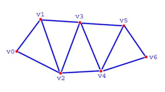
If the users screen width is below 991px and above 767px I want him or her to see two squares per row :
And when the users screen resolution is below 767px I want him or her to see one image per row.
That I have so far accomplished. Since my result is :
Now where my issue starts. I have tested this by using the FireFox inspection tool. Scaling the screen resolution and adjusting my HTML & CSS code. And it looks perfect.
However when I try to check my result in a windowed browserscreen all of a sudden the scaling is off. And I have almost immediately two screens next to one another. But an empty field on the right. As you can see on the following screen :
My code : HTML
         <section class="home-grid">
        <div class="grid-house" data-img="images/bg.jpg">
            <div class="house-grid-content">
                <h5>Name #1</h5>
            </div>
        </div>
        <div class="grid-house" data-img="images/bg.jpg">
            <div class="house-grid-content">
                <h5>Name #2</h5>
            </div>
        </div>
        <div class="grid-house" data-img="images/bg.jpg">
            <div class="house-grid-content">
                <h5>Name #3</h5>
            </div>
        </div>
     </section>
CSS
    .home-grid {
    background-color: #0f0f0f;
    display: inline-block;
    padding: 0px;
    }
    .grid-house {
        display: block;
        width: 33.02vw;
        height: 33.02vw;
    }
    .grid-house .house-grid-content {
        display: flex;
        justify-content: center;
        align-content: center;
        flex-direction: column;
        height: 100%;
        padding-left: 20%;
        padding-right: 20%;
        position: relative;
        z-index: 999;
    }
    @media only screen and (max-width: 991px) {
        .grid-house {
            width: 50vw;
            height: 50vw;
        }
    }
    @media only screen and (max-width: 767px) {
        .grid-house {
            width: 100vw;
            height: 100vw;
        }
    }
Edit: I have the head setup with the viewport meta-tag.
Solution by tacoshy, many thanks for that

