First, let me say that this site is not intended to be a code service. There is no presentation of the code you are working on. I am not affiliated with Plotly, and I created the graphs in Plotly because I think Plotly has elements that are a good example of a library where HTML can be used as an annotation. You are welcome to create your own to suit your own purposes.
df = df.replace('\%','', regex=True).astype(int)
import plotly.graph_objects as go
fig = go.Figure()
fig.add_trace(go.Bar(
y=df.index,
x=df['Bottom box'],
name='Bottom box',
orientation='h',
marker=dict(
color='rgb(196, 74, 70)',
line=dict(color='rgb(196, 74, 70)', width=1)
)
))
fig.add_trace(go.Bar(
y=df.index,
x=df['Middle'],
name='Middle',
orientation='h',
marker=dict(
color='rgb(178, 178, 178)',
line=dict(color='rgb(178, 178, 178)', width=1)
)
))
fig.add_trace(go.Bar(
y=df.index,
x=df['Top box'],
name='Top box',
orientation='h',
marker=dict(
color='rgb(81, 172, 201)',
line=dict(color='rgb(81, 172, 201)', width=1)
)
))
# bar labels
fig.add_trace(go.Scatter(
y=df.index,
x=[5,5,5,5],
mode='text',
text=['{}%'.format(x) for x in df['Bottom box']],
textfont=dict(
color='white',
size=16),
))
fig.add_trace(go.Scatter(
y=df.index,
x=[95,95,95,95],
mode='text',
text=['{}%'.format(x) for x in df['Top box']],
textfont=dict(
color='white',
size=16),
))
# title
fig.add_annotation(
x=-0.15,
y=1.25,
xref='paper',
yref='paper',
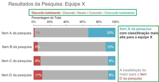
text='Resultados da Pesquisa: Equipe X',
font=dict(
color='rgb(178, 178, 178)',
size=24,
),
showarrow=False,
)
# legend text
legend_txt = ('<span style="color:rgb(196, 74, 70);font-size:14px;">Discordo totalmente </span>|'
+'<span style="color:rgb(178, 178, 178);font-size:14px;"> Discordo | Neutro | Concordo |</span>'
+'<span style="color:rgb(81, 172, 201);font-size:14px;"> Concordo totalmente</span><br>'
+'<span style="color:rgb(178, 178, 178);font-size:14px;"> Porcentagem do Total</span>')
fig.add_annotation(
x=-0.01,
y=1.15,
xref='paper',
yref='paper',
text=legend_txt,
showarrow=False,
)
# right text
right_text = ('<span style="color:rgb(81, 172, 201);font-size:14px;"> Item A da presquisa </span><br>'
+'<span style="color:"black";font-size:14px;">com classification mais<br>alta para asequipe X<span>')
fig.add_annotation(
x=1.25,
y=0.98,
xref='paper',
yref='paper',
text=right_text,
showarrow=False,
)
# right text
right_text2 = ('<span style="rgb(178, 178, 178);font-size:14px;"> A insatisfacao foi <br>'
+'maior para o </span><span style="color:rgb(196, 74, 70);font-size:14px;">item <br>D da pesquisa</span>')
fig.add_annotation(
x=1.20,
y=0.05,
xref='paper',
yref='paper',
text=right_text2,
showarrow=False,
)
fig.update_layout(autosize=True,
height=600,
width=800,
barmode='stack',
template='plotly_white',
showlegend=False,
margin=dict(l=0,r=150,t=120,b=0)
)
fig.update_yaxes(showgrid=False,
autorange="reversed",
showline=True,
linecolor='white',
tickfont=dict(
size=16,
family='sans serif',
))
fig.update_xaxes(
side='top',
linecolor='rgb(178, 178, 178)',
ticks='inside',
showgrid=False,
showline=True,
tickvals=np.arange(0,101,20),
ticktext=['{}%'.format(x) for x in np.arange(0,101,20)],
scaleanchor='x2',
)
fig.show()