The Expanded widget is supposed to take all the space available in a Row or a Column so you can't just limit its size by using SizedBox or any other method but you can do either of two things whichever suits your needs to limit its size:
Using the flex property of the Expanded Widget:
Row(
children: [
 Expanded(    //wrap all the widgets in your row with expanded
   flex:1,    //and provide a flex property (higher number equals more space taken)
   child: Container(
     decoration: BoxDecoration(
       color: Colors.red,
     ),
     child: SizedBox(
       height: 30,
       width: 50,
     ),
   ),
 ),
 Expanded(
   flex:2,     // which means flex:2 will take twice the amount
   child: Container(
     constraints:
         const BoxConstraints(minWidth: 50, maxWidth: 100),
     decoration: BoxDecoration(
       color: Colors.blue,
     ),
     child: SizedBox(
       height: 30,
     ),
   ),
 ),
 Expanded(
   flex:1,    //same for this one
   child: Container(
     decoration: BoxDecoration(
       color: Colors.green,
     ),
     child: SizedBox(
       height: 30,
       width: 50,
     ),
   ),
 ),
],
),
Result: 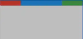
Limiting the width of the Row itself:
SizedBox(        //wrap your Row with a SizedBox and give it some width
     width: 200,
     child: Row(
  children: [
    Container(
Result: 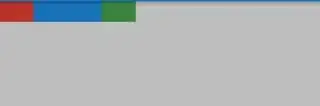
Edit: As you want to have an adaptable container you just need to change some things:
Row(
 mainAxisAlignment: MainAxisAlignment.spaceBetween, //add mainAxisAlignment to give spaceBetween the containers
  children: [
    Container(
      decoration: BoxDecoration(
        color: Colors.red,
      ),
      child: SizedBox(
        height: 30,
        width: 50,
      ),
    ),
    Container(
      height: 30, //give you container some height instead of a child SizedBox
      constraints:
        BoxConstraints(minWidth: MediaQuery.of(context).size.width/10, maxWidth: MediaQuery.of(context).size.width/5), // add responsive constraints which change values according to your screen size
      decoration: BoxDecoration(
      color: Colors.blue,
      ),
      child: Expanded(child: Container(),) //give it an Expanded widget to take in all the maxWidth
    ),
    Container(
      decoration: BoxDecoration(
        color: Colors.green,
      ),
      child: SizedBox(
        height: 30,
        width: 50,
      ),
    ),
  ],
),
And then you'll get this:
Shrinked:

Unshrinked:


