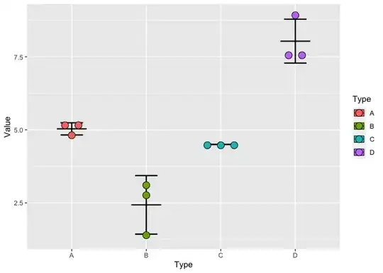
I have data that is categorical on the x axis and continuous on the y axis. I'm trying to produce a plot similar to this one:
I cannot figure out how to get the points to avoid overlapping - neither jitter not dodge seem to be quite what I'm looking for.
Here's an example with some data:
A <- c(5.1, 5.2, 4.8)
B <- c(1.3, 2.8, 3.2)
C <- c(4.5, 4.5, 4.5)
D <- c(8.9, 7.6, 7.6)

example <- data.frame(A, B, C, D) %>%
              pivot_longer(c(A,B,C, D),
                           names_to = "Type",
                           values_to = "Value",
                           cols_vary = "slowest")

ggplot(example, aes(x = Type, y = Value, fill = Type)) +
  stat_summary(fun = "mean",
               colour = "black",
               size = 0.3,
               width = 0.4,
               geom = "crossbar") +
  stat_summary(fun.data = mean_sdl,
               fun.args = list(mult = 1),
               geom = "errorbar",
               linewidth = 0.8,
               width = 0.3,
               colour = "black") +
  geom_point(size = 3,
             shape = 21,
             #alpha = 0.5,
             colour = "black",
             stroke = 1)
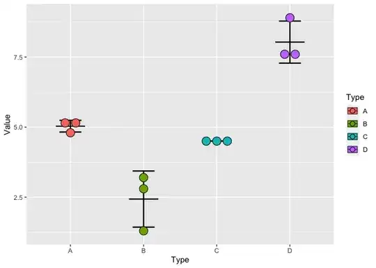
The plot it produces looks like this:

I want to be able to see all three points in groups C and D but I don't want to move the points in group B.
I don't want to introduce jitter - if the points don't overlap then I want them to stay centred and when they do overlap I want them to be evenly spaced.
Position_dodge works but applies to all categories rather than only when needed.
Using geom_dotplot gives the closest result but I don't want the values to be binned - the subtle differences in y values are important and the points need to be at their correct y positions.
Is there any way to acheive this in R?


