How do I add a border to a button? Is it possible to do this without resorting to use of images?
Asked
Active
Viewed 4.5e+01k times
252
Gabriele Mariotti
- 320,139
- 94
- 887
- 841
jeffreyveon
- 13,400
- 18
- 79
- 129
-
http://stackoverflow.com/questions/7626554/android-draw-border-in-imageview/7626628#7626628 Same way as here :) – asenovm Oct 07 '11 at 17:20
11 Answers
473
Step 1 : Create file named : my_button_bg.xml
Step 2 : Place this file in res/drawables.xml
Step 3 : Insert below code
<?xml version="1.0" encoding="utf-8"?>
<shape xmlns:android="http://schemas.android.com/apk/res/android"
  android:shape="rectangle">
  <gradient android:startColor="#FFFFFF"
    android:endColor="#00FF00"
    android:angle="270" />
  <corners android:radius="3dp" />
  <stroke android:width="5px" android:color="#000000" />
</shape>
Step 4: Use code "android:background="@drawable/my_button_bg" where needed eg below:
<Button
    android:layout_width="wrap_content"
    android:layout_height="wrap_content"
    android:text="Your Text"
    android:background="@drawable/my_button_bg"
    />
Kingsley Mitchell
- 2,412
- 2
- 18
- 25
Pedantic
- 5,032
- 2
- 24
- 37
-
1thanks.+1 for this.After saving it into drawable folder as a xml file.How can we use it ? – Android Killer Oct 07 '11 at 18:26
-
1
-
2Where does this code go, in the .axml code for the markup for the button? Does it go in a styles.xml type file? – theJerm Oct 13 '12 at 22:21
-
I used just the stroke (and made it white) to outline a Button with white. Works great with 4.4 but in 4.0.3 the button goes black - any ideas why? – Kibi Sep 23 '14 at 15:39
-
2@Kibi sorry someone edited my answer and gave you incorrect advice. I have changed it but I'm shocked that someone can edit an accepted answer and change the usefulness. – Pedantic Feb 11 '16 at 04:20
-
-
117
• Android Official Solution
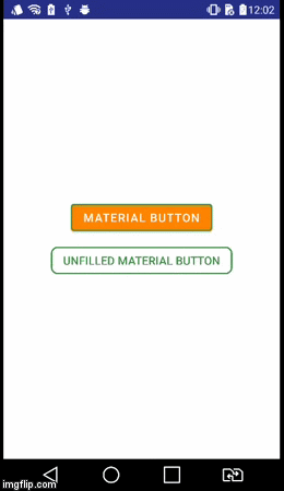
Since Android Design Support v28 was introduced, it's easy to create a bordered button using MaterialButton. This class supplies updated Material styles for the button in the constructor. Using app:strokeColor and app:strokeWidth you can create a custom border as following:
1. When you use androidx:
build.gradle
dependencies {
    implementation 'androidx.appcompat:appcompat:1.1.0'
    implementation 'com.google.android.material:material:1.0.0'
}
• Bordered Button:
<com.google.android.material.button.MaterialButton
    style="@style/Widget.AppCompat.Button.Colored"
    android:layout_width="wrap_content"
    android:layout_height="wrap_content"
    android:text="MATERIAL BUTTON"
    android:textSize="15sp"
    app:strokeColor="@color/green"
    app:strokeWidth="2dp" />
• Unfilled Bordered Button:
<com.google.android.material.button.MaterialButton
    style="@style/Widget.AppCompat.Button.Borderless"
    android:layout_width="wrap_content"
    android:layout_height="wrap_content"
    android:text="UNFILLED MATERIAL BUTTON"
    android:textColor="@color/green"
    android:textSize="15sp"
    app:backgroundTint="@android:color/transparent"
    app:cornerRadius="8dp"
    app:rippleColor="#33AAAAAA"
    app:strokeColor="@color/green"
    app:strokeWidth="2dp" />
2. When you use appcompat:
build.gradle
dependencies {
    implementation 'com.android.support:design:28.0.0'
}
style.xml
Ensure your application theme inherits from Theme.MaterialComponents instead of Theme.AppCompat.
<style name="AppTheme" parent="Theme.MaterialComponents.Light.DarkActionBar">
    <!-- Customize your theme here. -->
</style>
• Bordered Button:
<android.support.design.button.MaterialButton
    android:layout_width="wrap_content"
    android:layout_height="wrap_content"
    android:text="MATERIAL BUTTON"
    android:textSize="15sp"
    app:strokeColor="@color/green"
    app:strokeWidth="2dp" />
• Unfilled Bordered Button:
<android.support.design.button.MaterialButton
    style="@style/Widget.AppCompat.Button.Borderless"
    android:layout_width="wrap_content"
    android:layout_height="wrap_content"
    android:text="UNFILLED MATERIAL BUTTON"
    android:textColor="@color/green"
    android:textSize="15sp"
    app:backgroundTint="@android:color/transparent"
    app:cornerRadius="8dp"
    app:rippleColor="#33AAAAAA"
    app:strokeColor="@color/green"
    app:strokeWidth="2dp" />
Visual Result
aminography
- 21,986
- 13
- 70
- 74
-
I see you've got textColor and textSize declared in your button XML. What do you suggest if someone already has a style defined for textColor and textSize and now they want to add the `style="@style/Widget.AppCompat.Button.Borderless"` ? – Someone Somewhere Mar 06 '19 at 15:46
-
I've got it figured out, see https://developer.android.com/guide/topics/ui/look-and-feel/themes#Customize – Someone Somewhere Mar 06 '19 at 16:07
-
As you mentioned, it is possible to define a style which inherits from borderless style, then add preferred attributes according to the base style. – aminography Mar 06 '19 at 17:27
-
Slightly OT, but what's the interesting 4th icon in the action bar at the bottom of the GIF? (Also it looks like the GIF was grabbed from a real device, cool) – i336_ Dec 22 '19 at 02:24
-
@i336_ :) Yes, I was running it on a real device which supports 2 SIMs. – aminography Dec 22 '19 at 12:40
-
1Maybe I'm wrong but for me in the • Unfilled Bordered Button, I had to change, app:backgroundTint="@color/transparent" to app:backgroundTint="@android:color/transparent" – xarly Mar 04 '20 at 11:27
-
@xarly: You are right since I was declared transparent color in the project resource values. – aminography Mar 04 '20 at 11:44
-
it doesnt work for me in Xamarin.Android. the Unfilled Bordered Button with the same code does not have solid border but it has something like a shadow border around the button – CDrosos Aug 07 '20 at 20:47
-
7
49
Create a button_border.xml file in your drawable folder.
res/drawable/button_border.xml
<?xml version="1.0" encoding="utf-8"?>
<shape xmlns:android="http://schemas.android.com/apk/res/android"
    android:shape="rectangle" >

    <solid android:color="#FFDA8200" />

    <stroke
        android:width="3dp"
        android:color="#FFFF4917" />

</shape>
And add button to your XML activity layout and set background android:background="@drawable/button_border".
<Button
    android:layout_width="wrap_content"
    android:layout_height="wrap_content"
    android:background="@drawable/button_border"
    android:text="Button Border" />
aminography
- 21,986
- 13
- 70
- 74
Karina Sen
- 507
- 4
- 4
21
create drawable/button_green.xml:
<?xml version="1.0" encoding="utf-8"?>
<shape xmlns:android="http://schemas.android.com/apk/res/android"
  android:shape="rectangle">
  <gradient
    android:startColor="#003000"
    android:centerColor="#006000"
    android:endColor="#003000"
    android:angle="270" />
  <corners android:radius="5dp" />
  <stroke android:width="2px" android:color="#007000" />
</shape>
and point it out as @drawable/button_green:
<Button
        android:id="@+id/button1"
        android:layout_width="wrap_content"
        android:layout_height="wrap_content"
        android:layout_margin="10dp"
        android:background="@drawable/button_green"
        android:text="Button" />
vitperov
- 1,347
- 17
- 20
20
Please look here about creating a shape drawable http://developer.android.com/guide/topics/resources/drawable-resource.html#Shape
Once you have done this, in the XML for your button set android:background="@drawable/your_button_border"
dymmeh
- 22,247
- 5
- 53
- 60
9
If your button does not require a transparent background, then you can create an illusion of a border using a Frame Layout. Just adjust the FrameLayout's "padding" attribute to change the thickness of the border.
<FrameLayout
        android:layout_width="wrap_content"
        android:layout_height="wrap_content"
        android:padding="1sp"
        android:background="#000000">
        <Button
            android:layout_width="wrap_content"
            android:layout_height="wrap_content"
            android:text="Your text goes here"
            android:background="@color/white"
            android:textColor="@color/black"
            android:padding="10sp"
            />
</FrameLayout>
I'm not sure if the shape xml files have dynamically-editable border colors. But I do know that with this solution, you can dynamically change the color of the border by setting the FrameLayout background.
Rock Lee
- 9,146
- 10
- 55
- 88
7
In your XML layout:
<Button
    android:id="@+id/cancelskill"
    android:layout_width="0dp"
    android:layout_height="wrap_content"
    android:layout_marginLeft="25dp"
    android:layout_weight="1"
    android:background="@drawable/button_border"
    android:padding="10dp"
    android:text="Cancel"
    android:textAllCaps="false"
    android:textColor="#ffffff"
    android:textSize="20dp" />
In the drawable folder, create a file for the button's border style:
<shape xmlns:android="http://schemas.android.com/apk/res/android"
    android:shape="rectangle" >
    <stroke
        android:width="1dp"
        android:color="#f43f10" />
</shape>
And in your Activity:
    GradientDrawable gd1 = new GradientDrawable();
    gd1.setColor(0xFFF43F10); // Changes this drawbale to use a single color instead of a gradient
    gd1.setCornerRadius(5);
    gd1.setStroke(1, 0xFFF43F10);

    cancelskill.setBackgroundDrawable(gd1);

    cancelskill.setOnClickListener(new View.OnClickListener() {

        @Override
        public void onClick(View v) {
            cancelskill.setBackgroundColor(Color.parseColor("#ffffff"));
            cancelskill.setTextColor(Color.parseColor("#f43f10"));

            GradientDrawable gd = new GradientDrawable();

            gd.setColor(0xFFFFFFFF); // Changes this drawbale to use a single color instead of a gradient
            gd.setCornerRadius(5);
            gd.setStroke(1, 0xFFF43F10);
            cancelskill.setBackgroundDrawable(gd);

            finish();
        }
    });
RominaV
- 3,335
- 1
- 29
- 59
Raseem Ayatt
- 970
- 10
- 14
5
I know its about a year late, but you can also create a 9 path image There's a tool that comes with android SDK which helps in creating such image See this link: http://developer.android.com/tools/help/draw9patch.html
PS: the image can be infinitely scaled as well
himura
- 1,555
- 3
- 19
- 30
4
<com.google.android.material.button.MaterialButton
                android:id="@+id/addBtn"
                style="@style/Widget.MaterialComponents.Button.OutlinedButton"
                android:layout_width="150dp"
                android:layout_height="80dp"
                android:gravity="center"
                android:backgroundTint="@android:color/transparent"
                android:textColor="@color/blue"
                app:cornerRadius="8dp"
                app:strokeColor="@color/blue"
                app:strokeWidth="2dp"/>
Timchang Wuyep
- 629
- 7
- 10
4
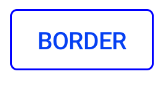
With the Material components library just use a MaterialButton with the Widget.MaterialComponents.Button.OutlinedButton style.
You can customize color and width with the strokeColor and strokeWidth attributes
<com.google.android.material.button.MaterialButton
   ....
   style="?attr/materialButtonOutlinedStyle"
   app:strokeColor="@color/colorPrimary"/>

With Jetpack compose use an OutlinedButton.
Use the border attribute to customize width and color.
OutlinedButton(
    onClick = { },
    border = BorderStroke(1.dp, Color.Blue),
) {
    Text(text = "BORDER")
}
Gabriele Mariotti
- 320,139
- 94
- 887
- 841
0
In your drawable folder create a drawable file called gradient_btn and paste the code below
<?xml version="1.0" encoding="utf-8"?>
<shape xmlns:android="http://schemas.android.com/apk/res/android"
android:shape="rectangle">
<gradient android:startColor="#7BF8C6"
    android:centerColor="#9DECAD"
    android:endColor="#7BF8C6"
    android:angle="270" />
<corners
    android:topLeftRadius="15dp"
    android:topRightRadius="15dp"
    android:bottomLeftRadius="15dp"
    android:bottomRightRadius="15dp"
    />
<stroke android:width="3px" android:color="#000000" />

</shape>
Then in your Button code in xml call the file you created:
    <Button
        android:id="@+id/button"
        android:layout_width="wrap_content"
        android:layout_height="wrap_content"
        android:text="Button"
        android:background="@drawable/gradient_btn"/>
Output - Will be a button with gradient and border.
Note - You can change the Hexa decimal codes of the buttons as you wish and also you can change the stroke width.
Philip Niron
- 141
- 1
- 2