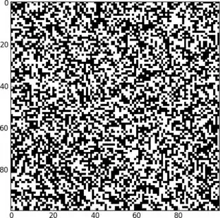
I'm using python to simulate some automation models, and with the help of matplotlib I'm producing plots like the one shown below.

I'm currently plotting with the following command:
ax.imshow(self.g, cmap=map, interpolation='nearest')
where self.g is the binary map (0 -> blue, 1 -> red in my current plots).
However, to include this in my report I would like the plot to be with black dots on white background instead of red on blue. How do I accomplish that?