In android the Toggle buttons are looks like below -

Can we modify this as Iphone style like below -
And, Can we include the iphone functionality of toggle button like drag to toggle feature also.
How to complete this action? Thanks in Advance.
In android the Toggle buttons are looks like below -
Can we modify this as Iphone style like below -
And, Can we include the iphone functionality of toggle button like drag to toggle feature also.
How to complete this action? Thanks in Advance.
Use SwitchCompat:
<!-- SwitchCompat -->
    <androidx.appcompat.widget.SwitchCompat
                android:layout_width="wrap_content"
                android:layout_height="wrap_content"
                android:checked="true"
                android:thumb="@drawable/thumb_selector"
                app:track="@drawable/track_selector"/>


 <!-- thumb_selector.xml -->
      <?xml version="1.0" encoding="utf-8"?>
            <selector xmlns:android="http://schemas.android.com/apk/res/android">
                <item android:state_checked="false">
                    <shape android:shape="oval">
                        <solid android:color="@android:color/white" />
                        <size android:width="20dp" android:height="20dp" />
                        <stroke android:width="2dp" android:color="#0000ffff" />
                    </shape> <!-- shape circle -->
                </item>
            </selector>

 <!-- track_selector.x -->
<?xml version="1.0" encoding="utf-8"?>
<selector xmlns:android="http://schemas.android.com/apk/res/android">

    <item android:state_checked="true">
        <shape android:shape="rectangle">
            <size android:width="36dp" android:height="20dp"/>
            <solid android:width="1dp" android:color="@android:color/holo_orange_dark"/>
            <corners android:radius="50dp"/>
        </shape>
    </item>

    <item android:state_checked="false">
        <shape android:shape="rectangle">
            <size android:width="36dp" android:height="20dp"/>
            <solid android:width="1dp" android:color="@android:color/darker_gray"/>
            <corners android:radius="50dp"/>
        </shape>
    </item>

</selector>

You just have to provide 2 drawables.
<ToggleButton
        android:layout_width="wrap_content"
        android:layout_height="wrap_content"
        android:background="@drawable/toggle_me"/>
and the drawable will be something like:
<selector xmlns:android="http://schemas.android.com/apk/res/android">
    <item android:state_checked="true"
        android:drawable="@drawable/toggle_me_on" /> <!-- checked -->
    <item android:drawable="@drawable/toggle_me_off" /> <!-- default/unchecked -->
</selector>
Unfortunately, this solution doesn't provide great transition effects, but will give you exactly what you asked.
If you want to do with shapes (without using images) try this. Currently im using it in a custom checkbox


<com.myapp.views.MyCheckBox xmlns:android="http://schemas.android.com/apk/res/android"
        android:id="@android:id/checkbox"
        android:layout_width="wrap_content"
        android:layout_height="wrap_content"
        android:layout_marginRight="5dp"
        android:button="@null"
        android:checked="false"
        android:clickable="false"
        android:drawableRight="@drawable/checkbox_selector"
        android:focusable="false"
        android:textColor="@color/orange" />
checkbox_selector.xml
<?xml version="1.0" encoding="utf-8"?>
<selector xmlns:android="http://schemas.android.com/apk/res/android" >

    <item android:state_checked="false"
        android:drawable="@drawable/toggle_button_off" /> <!-- pressed -->
    <item android:state_checked="true"
        android:drawable="@drawable/toggle_button_on" /> <!-- focused -->
    <!-- default -->
    <item
        android:drawable="@drawable/toggle_button_off" />
</selector>
toggle_button_off.xml
<?xml version="1.0" encoding="utf-8"?>
<layer-list xmlns:android="http://schemas.android.com/apk/res/android">
    <item android:drawable="@drawable/toggle_background_off"></item>
    <item


        android:drawable="@drawable/white_toggle_icon"
        android:left="2dp"
        android:right="27.5dp"
        android:bottom="1.5dp"
        android:top="1.5dp"></item>
</layer-list>
toggle_button_on.xml
<?xml version="1.0" encoding="utf-8"?>
<layer-list xmlns:android="http://schemas.android.com/apk/res/android">
    <item android:drawable="@drawable/toggle_background_on"></item>

    <item


        android:drawable="@drawable/white_toggle_icon"
        android:right="2dp"
        android:left="27.5dp"
        android:bottom="1.5dp"
        android:top="1.5dp"></item>
</layer-list>
toggle_background_off.xml
<?xml version="1.0" encoding="utf-8"?>
<shape xmlns:android="http://schemas.android.com/apk/res/android"
    android:shape="rectangle">


    <size android:height="32dp" android:width="60dp"/>
    <solid android:width="1dp" android:color="#919090"/>

    <corners android:radius="18dp" />

</shape>
toggle_background_on.xml
<?xml version="1.0" encoding="utf-8"?>
<shape xmlns:android="http://schemas.android.com/apk/res/android"
    android:shape="rectangle">


    <size android:height="32dp" android:width="60dp"/>
    <solid android:width="1dp" android:color="@color/orange"/>

    <corners android:radius="18dp" />
</shape>
white_toggle_icon.xml
<?xml version="1.0" encoding="utf-8"?>
<shape xmlns:android="http://schemas.android.com/apk/res/android"
    android:shape="oval">
 <solid android:color="#ffffff"/>
   <stroke android:width="2dp" android:color="#fff" />
   <size android:width="25dp" android:height="25dp"/>
</shape>
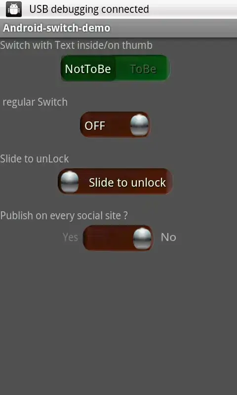
Use of below code from Android-Switch-Demo example. I can get desired output.
public MySwitch(Context context, AttributeSet attrs, int defStyle) {
    super(context, attrs, defStyle);

    mTextPaint = new TextPaint(Paint.ANTI_ALIAS_FLAG);
    Resources res = getResources();
    mTextPaint.density = res.getDisplayMetrics().density;
    mTextPaint.setShadowLayer(0.5f, 1.0f, 1.0f, Color.BLACK);

    TypedArray a = context.obtainStyledAttributes(attrs,
            R.styleable.MySwitch, defStyle, 0);

    mThumbDrawable = a.getDrawable(R.styleable.MySwitch_thumb);
    mTrackDrawable = a.getDrawable(R.styleable.MySwitch_track);
    mTextOn = a.getText(R.styleable.MySwitch_textOn);
    mTextOff = a.getText(R.styleable.MySwitch_textOff);
    mTextOutsideTrack = a.getBoolean(R.styleable.MySwitch_textOutsideTrack, false);
    mTextOnThumb = a.getBoolean(R.styleable.MySwitch_textOnThumb, false);
    mThumbTextPadding = a.getDimensionPixelSize( R.styleable.MySwitch_thumbTextPadding, 0);
    mTrackTextPadding = a.getDimensionPixelSize( R.styleable.MySwitch_trackTextPadding, 0);
    mSwitchMinWidth = a.getDimensionPixelSize( R.styleable.MySwitch_switchMinWidth, 0);
    mSwitchMinHeight = a.getDimensionPixelSize( R.styleable.MySwitch_switchMinHeight, 0);
    mSwitchPadding =  a.getDimensionPixelSize( R.styleable.MySwitch_switchPadding, 0);

    mTrackDrawable.getPadding(mTrackPaddingRect) ;
    //Log.d(TAG, "mTrackPaddingRect=" + mTrackPaddingRect);
    mThumbDrawable.getPadding(mThumbPaddingRect);
    //Log.d(TAG, "mThumbPaddingRect=" + mTrackPaddingRect);


    int appearance = a.getResourceId(R.styleable.MySwitch_switchTextAppearanceAttrib, 0);
    if (appearance != 0) {
        setSwitchTextAppearance(context, appearance);
    }
    a.recycle();

    ViewConfiguration config = ViewConfiguration.get(context);
    mTouchSlop = config.getScaledTouchSlop();
    mMinFlingVelocity = config.getScaledMinimumFlingVelocity();

    // Refresh display with current params
    refreshDrawableState();
    setChecked(isChecked());
    this.setClickable(true);
    //this.setOnClickListener(clickListener);
}
Screenshot of the Application -
My SwitchCompat with 62dp with and 26dp height (base on @Thắng answer but I add 2 more TextView and 1 style)
<androidx.constraintlayout.widget.ConstraintLayout
    android:layout_width="wrap_content"
    android:layout_height="wrap_content"
    app:layout_constraintBottom_toBottomOf="parent"
    app:layout_constraintLeft_toLeftOf="parent"
    app:layout_constraintRight_toRightOf="parent"
    app:layout_constraintTop_toTopOf="parent">

    <androidx.appcompat.widget.SwitchCompat
        android:id="@+id/switch_on_off"
        android:layout_width="wrap_content"
        android:layout_height="wrap_content"
        android:checked="true"
        android:theme="@style/MyIOSSwitch"
        android:thumb="@drawable/switch_thumb_selector"
        app:layout_constraintLeft_toLeftOf="parent"
        app:layout_constraintTop_toTopOf="parent"
        app:track="@drawable/switch_track_selector" />

    <TextView
        android:id="@+id/switch_text_on"
        android:layout_width="31dp"
        android:layout_height="match_parent"
        android:gravity="center"
        android:paddingLeft="4dp"
        android:text="ON"
        android:textColor="#fff"
        android:textSize="12sp"
        app:layout_constraintBottom_toBottomOf="parent"
        app:layout_constraintLeft_toLeftOf="parent"
        app:layout_constraintRight_toLeftOf="@id/switch_text_off"
        app:layout_constraintTop_toTopOf="parent" />

    <TextView
        android:id="@+id/switch_text_off"
        android:layout_width="31dp"
        android:layout_height="match_parent"
        android:gravity="center"
        android:paddingRight="4dp"
        android:text="OFF"
        android:textColor="#fff"
        android:textSize="12sp"
        app:layout_constraintBottom_toBottomOf="parent"
        app:layout_constraintLeft_toRightOf="@id/switch_text_on"
        app:layout_constraintRight_toRightOf="parent"
        app:layout_constraintTop_toTopOf="parent" />

</androidx.constraintlayout.widget.ConstraintLayout>
switch_thumb_selector.xml
<?xml version="1.0" encoding="utf-8"?>
<selector xmlns:android="http://schemas.android.com/apk/res/android">
    <item>
        <shape android:shape="rectangle">
            <size android:width="31dp" android:height="26dp" />
            <solid android:color="@android:color/white" />
            <stroke android:width="2dp" android:color="@android:color/transparent"/>
            <corners android:radius="26dp"/>
        </shape>
    </item>
</selector>
switch_track_selector.xml
<?xml version="1.0" encoding="utf-8"?>
<selector xmlns:android="http://schemas.android.com/apk/res/android">
    <item android:state_checked="true">
        <shape android:shape="rectangle">
            <size android:width="62dp" android:height="26dp" />
            <solid android:color="#F50000" />
            <corners android:radius="26dp" />
        </shape>
    </item>

    <item android:state_checked="false">
        <shape android:shape="rectangle">
            <size android:width="62dp" android:height="26dp" />
            <solid android:color="#888888" />
            <corners android:radius="26dp" />
        </shape>
    </item>
</selector>
themes.xml
<resources xmlns:tools="http://schemas.android.com/tools">
    ...
    <!-- It helps change color when you press and slide on Switch -->
    <style name="MyIOSSwitch" parent="Theme.AppCompat.Light">
          <item name="colorControlActivated">#F50000</item>
          <item name="android:colorForeground">#888888</item>
    </style>
</resources>
You don't need to show/hide text ON/OFF because color of both thumb and text is white. If your text color is different, you can show/hide text by listen to setOnCheckedChangeListener on SwitchCompat
It can be done using com.google.android.material.switchmaterial.SwitchMaterial
We can get a Good transition also
<com.google.android.material.switchmaterial.SwitchMaterial
android:id="@+id/switch1"
android:layout_width="wrap_content"
android:layout_height="wrap_content"
android:switchMinWidth="56dp"
android:layout_marginLeft="100dp"
android:layout_marginTop="120dp"
android:text="Switch1:"
android:thumb="@drawable/thumb_selector"
app:track="@drawable/track_selector"
android:checked="true"
app:thumbTint="@color/white"
app:trackTintMode="multiply"
android:layout_marginStart="100dp" />
thumb_selector.xml
<?xml version="1.0" encoding="utf-8"?>
<selector xmlns:android="http://schemas.android.com/apk/res/android">
<item android:state_checked="false">
    <shape android:shape="oval">
        <solid android:color="@android:color/white" />
        <size android:width="20dp" android:height="20dp" />
        <stroke android:width="2dp" android:color="#0000ffff" />
    </shape>
</item>
<item android:state_checked="true">
    <shape android:shape="oval">
        <solid android:color="@android:color/white" />
        <size android:width="20dp" android:height="20dp" />
        <stroke android:width="2dp" android:color="#0000ffff" />
    </shape>
</item>
</selector>`
track_selector.xml
<?xml version="1.0" encoding="utf-8"?>
<selector xmlns:android="http://schemas.android.com/apk/res/android">

<item android:state_checked="true">
    <shape android:shape="rectangle">
        <size android:width="36dp" android:height="20dp"/>
        <solid android:width="1dp" android:color="@color/primary"/>
        <corners android:radius="50dp"/>
    </shape>
</item>

<item android:state_checked="false">
    <shape android:shape="rectangle">
        <size android:width="36dp" android:height="20dp"/>
        <solid android:width="1dp" android:color="@android:color/darker_gray"/>
        <corners android:radius="50dp"/>
    </shape>
</item>

</selector>


take all the images of off and on button and make a layout in relative layout like this
            <RelativeLayout
                android:id="@+id/setting1"
                android:layout_width="90dp"
                android:layout_height="wrap_content"
                android:layout_alignParentRight="true"
                android:layout_alignParentTop="true"
                android:background="@drawable/switchon"
                android:clickable="true"
                android:onClick="setting1Click" >

                <ImageView
                    android:id="@+id/settingicon"
                    android:layout_width="wrap_content"
                    android:layout_height="wrap_content"
                    android:layout_alignParentRight="true"
                    android:src="@drawable/switchball" />

                <TextView
                    android:id="@+id/calsettingtxt"
                    android:layout_width="wrap_content"
                    android:layout_height="wrap_content"
                    android:layout_centerVertical="true"
                    android:layout_marginRight="10dp"
                    android:layout_toLeftOf="@+id/settingicon"
                    android:text="@string/settingon"
                    android:textColor="@color/black"
                    android:textSize="18sp"
                    android:textStyle="bold" />
            </RelativeLayout>
then in code when on is pressed make the background resource as off
