If I understood correctly, subpixel rendering was originally designed to do anti-aliasing and improve the quality of text on LCD screens. It makes use of the fact that each pixel on a color LCD is actually a bunch of individual red, green, and blue subpixels and does some magic with them to make text sharper. The physical properties of a CRT display is quite different. So, does subpixel rendering still work on CRT displays?
Asked
Active
Viewed 5,044 times
5 Answers
14
Not as such. The results vary from screen to screen between "blurry mess" to "nice and clear".
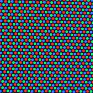
Most computer monitor CRTs have a shadow mask which has a triangular arrangement of colors.
Here there is clearly no way that subpixel rendering can work the way it should. However, you still get the difference in brightness and CRTs being blurrier than LCDs may make the text appear similarly to conventionally-smoothed text (which uses just grayscale to smooth the edges).
Some computer screens have an aperture grille and I happened to use one of those for several years.
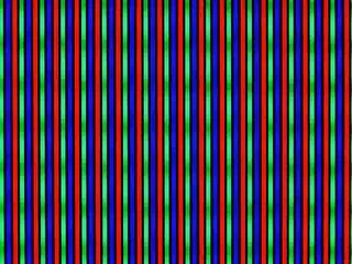
Here you can actually have a similar effect as on LCD screens for ClearType, especially when hitting the maximum resolution of the display (I tended to do so because my eyes work and I valued the space on screen :)). However, there is no guarantee that every pixel will lie exactly at the boundaries you would like it to lie. Also with older monitors the dimensions of the image tend to vary with overall brightness of the image. But at least for me subpixel rendering on such a screen was superior to grayscale antialiasing.
3
When I used a 17" CRT on it's maximum resolution (1280*1024), I enabled subpixel rendering and it actually looked better.
Daniel S
- 183
0
It depends. If you ask two people about the difference between MP3 and a FLAC you will get vastly different results - it depends how fussy you are.
Technically you should get color bleeding instead of clean edges; but chances are you wouldn't notice it. Especially if the dot pitch is low enough - which CRTs are good with these days.
Back in the stone age when I used CRT I enabled it and as Daniel said the quality was better, for me at least. I saw absolutely no color bleed (even on a crappy $80 CRT at that) and had reduced eye strain.
0
Nice to see someone still using CRT (too bad I don't have one to experiment in this direction).
Existing technologies, designed for text (ClearType, Freetype, something in Quartz) - only designed for orthogonal layout with fixed in-pixel layout. However, there are successful experiments downscaling images with LCD subpixel layout awareness (when each subpixel is considered as position for pixel, though 3x weaker and overlapping with others). So - should be no problem trying that with even wich CRT monitor layour, which may be a bit alien, but possible to optimize to.
What should be cared in case of CRT monitor layout as in above picture:
- It's triangular mesh. However, given that each pixel has one triad on native resolution, it's expected to still have an order. It's just hard to see, when there's no visible border between pixels for eye to anchor.
- Subpixel layout may see messy, but I see two different layouts per pixel, each reflecting other vertically, just like trinangle, they are associated with.
- Finally, at in-triangle level layout is fixed. I see stable red in left, green at right and blue at top placement. In vertically fliped variant - entire structure is fliped, but otherwise is same.
- Normal and fliped triangles are interleaved between columns, but not between rows, thus there are per-row triangular meshes.
- Each subpixel still belongs to certain pixel, at least at native resolution.
Now, what are possible issues:
- 2d image usually use rectangular pixel shape. But in CRT monitor they are triangles, elements or triangular mesh.
- Any maginable pixel in LCD layout is always centered around some pixel. Bee it green, if this pixel is in center of native pixel, or blur or red if it's displaced by 1/3 of native. However, these triangular pixels have center inside triangle, out of all pixels. This may be important when attempting to map regular HD image to this triangular subpixel grid. Thus - calculating color for subpixel position is wrong - they each have 6 more surrounding elements, and including them to minimum pixel area would make pixture rather blurry.
This is all ideas I got about implementing subpixel rendering for CRT subpixel layout. Any graphics editor like gimp or photoshot should be fine for first steps.
There's example of how they did it with LCD layout (not mandatory imagemagick, rather to understand steps): https://legacy.imagemagick.org/discourse-server/viewtopic.php?p=74544
0
Although ClearType was not designed specifically for CRTs, I found it greatly improved text rendering quality when I tried enabling ClearType on my CRT years ago. Of course it's probably less effective than LCDs because of the differences in pixel layout, but still better than none. Probably it'll be better on monitors with aperture grille. This is what Microsoft said:
ClearType Antialiasing
Microsoft ClearType antialiasing is a smoothing method that improves font display resolution over traditional antialiasing. It dramatically improves readability on color LCD monitors with a digital interface, such as those in laptops and high-quality flat desktop displays. Readability on CRT screens is also somewhat improved.
https://docs.microsoft.com/en-us/windows/desktop/gdi/cleartype-antialiasing
Q. Will ClearType improve text display on CRT monitors?
A. Yes, but less so than with LCD displays. Because a standard cathode-ray tube (CRT) screen uses an electron beam to activate pixels, ClearType does not provide the same benefits that you experience on an LCD screen. However, because ClearType still applies a form of filtering similar to traditional antialiasing, you may see some improvement when enabling ClearType on a CRT screen.
https://web.archive.org/web/20110228032333/https://www.microsoft.com/typography/ClearTypeFAQ.mspx
More specifically, the ClearType technology is optimized for LCD panels with red, green, and blue (RGB) striped sub-pixels that are oriented vertically, although it performs reasonably well on CRT displays (especially those that are aperture grille based) and even LCD panels with horizontally oriented RGB stripes. Although this might seem counterintuitive, through informal studies, we’ve found that about 70% of users prefer ClearType even on these non-optimal displays. Of the 30% who preferred other rendering techniques, their biggest concern with ClearType in these non-optimal cases was the loss of text contrast.
... Even though there were still CRTs in use, feedback from Windows XP customers was positive on the quality of ClearType rendering on CRTs. After we made the choice, the feedback on the decision to enable ClearType as the default for Windows Vista was overwhelmingly positive.
https://docs.microsoft.com/en-us/archive/blogs/e7/engineering-changes-to-cleartype-in-windows-7
To get the full benefit of ClearType, you need a high-quality, flat-panel monitor, such as LCD or plasma. Even on a CRT monitor, you might get some improvement in readability with ClearType.
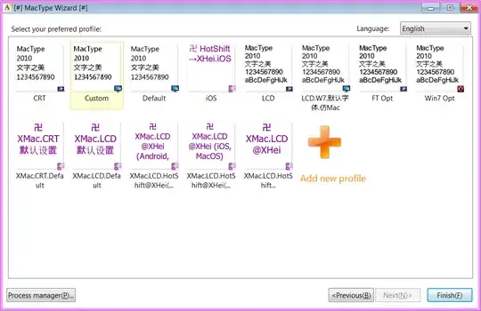
If that doesn't work for you, you can try 3rd party rendering solutions like GDIPP or Mactype which has a profile for CRT rendering, or you can create your own profile
See Anything (apart from GDI++) to improve font rendering on Windows?
phuclv
- 30,396
- 15
- 136
- 260