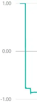
PowerBI automatically builds graphs based on my data, but often times it will have few (or ZERO) horizontal lines going accross the Y Axis. It makes it very difficult to see where the data is landing across my graph. I would like to add additional lines and numers recorded along the Y axis here but so no way to do it.
How can I add more granularity to labels on the Y axis, including lines going across horizontally? Thanks!
