1

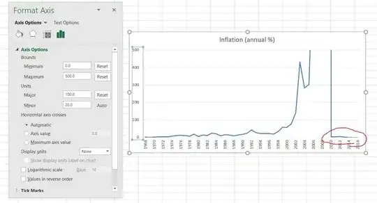
This is the Y-axis format I want

enter image description here

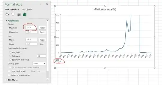
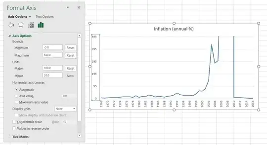
The problem is that the last few values are very small negative numbers, and the line gets cut off as a result. When I expand the Y axis minimum value (as seen here):

enter image description here

this prevents the line from being cut off, but changes the Y-axis format, creating a label and gridline at -5, which I do not want. Essentially, I want the graph to go down to Y=-3 or so, but keep the Y-axis labels and gridlines at 0,100,200, etc.

This is the closest I can get:

enter image description here

If you were to crop the graph just below the X-axis labels, so that there is no -100 value or gridline shown, it would be the graph I am looking for.
DavidPostill
  • 162,382
Tyler
  • 11
  • 1
  • 3

2 Answers2

1

You can use a custom number format to get rid of the -100 axis label. This approach comes from an answer by @JonPeltier.

Format the y-axis and under "Number", uncheck the "Linked to Source" box and add a custom format like:

#,##0;;#,##0

The format for negative numbers (which would be between the two semicolons) is blank, so negative numbers won't appear.

Getting rid of the gridline is trickier. I don't think any version of Excel allows you to select just one gridline, to delete or format it. Any changes apply to all horizontal (or vertical) gridlines.

I think the best you can do is add a shape to your graph to cover the gridline. This is generally under Insert > Shape... or Insert > Picture > Shape... After you've added it, CTRL-click the shape and format it with no line, no shadow, no gradient and white fill. Then drag it into place to cover the gridline.

Bandersnatch
  • 3,641
0

So, this is definitely not a great answer, but maybe it will be good enough to help you...
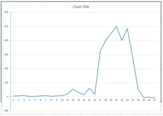
If you copy a range of cells, such as the green outlined selection in this screenshot,

Original Graph

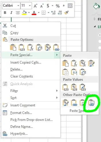
And then past as a linked picture...

Paste as Linked Picture

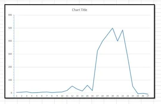
The pasted image is cropped where the cell boundaries were on the original selection. As you can see in this pic.

Pasted Graph Picture

There is still a small tail visible on the vertical axis, but you can eliminate most of the excess from your example.