4

I have measurements for multiple devices, and have their mean and sd values. I would like to produce a chart that would show these values, and I think the best would be if I could have something that looks like a bar chart(-ish) - the device names in x axis, values in y axis, and for each device to have a 'floating' bar that would represent values (mean - sd :: mean + sd), and some marker in the middle to show the actual mean value. is it doable? or would you suggest some other chart?

Thanks a lot

Kenster
  • 8,620

3 Answers3

2

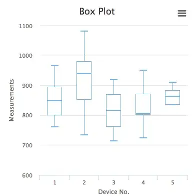
If you just have two or three devices and their data, you could use a Normal distribution or Bell curve to plot your mean and standard deviation. But if you have more devices, I recommend you to use Box Plot. I made a sample for your problem and it looks like this.

enter image description here

HighLights

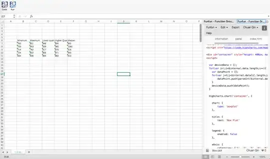
While Excel doesn't have original box plot support, you could draw this kind of chart easily using JavaScript libaries like HightCharts.js that I'm using for this sample. You could use Funfun to write and run JavaScript code in Excel, so that drawing a box plot like this would be easier in Excel. Here is the code that I used in the Funfun Online Editor:

https://www.funfun.io/1/edit/5a364ae474efa7334ff27269

The box plot could give the readers more information about your measurements. But you need to make some modification to your data. In this case, I used quartile and median to reveal the data. So in order to draw this chart, your data should look like this.

           Minimum  Maximum Lower quartile  Higher Quartile Median
 Device1     760      801        848             895         965
 Device2     733      853        939             980         1080
 Device3     714      762        817             870         918

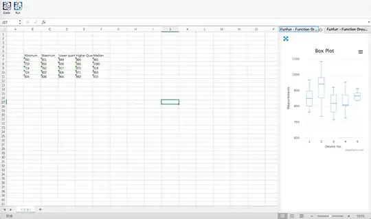
Then, with the code in the link above, you could use FunFun add-in to load the chart directly into your excel using the URL above.

enter image description here

enter image description here

enter image description here

Disclosure: I'm a developer of Funfun

Chuan Qin
  • 297
2

I think you're looking for a box-and-whisker plot.

Here are instructions to create them in Excel:

Usually the median, quartile, and extreme values are used; but you could use mean and standard deviation(s).

Leftium
  • 9,335
1

The best I've found is this one: http://peltiertech.com/WordPress/excel-box-and-whisker-diagrams-box-plots/

  • Supports vertical and horizontal charts
  • Displays the mean in addition to the quartiles and median.
  • Comes with an Excel file to tweak for quick results.
ewernli
  • 141