2

Is it possible to create a Pivot bar graph that Shows percentage and Count in the same bar? I only have Excel 2010

MWE:

Firm    Product
1   Car
2   Ship
3   Car
4   Ship
5   Car

I can easily create a Pivot table / charte using Product in the value and row category to get either the Count for car and ship 3 and 2 or the percentage 60% and 40% and the coresponding bar graph. I would like to Show the bar graph with Count at the y axis and Show the percentage on top or within the bar (similar to think cell). I can create the graph and adjust the bar description manually, but that seems to be very tedious and error prone
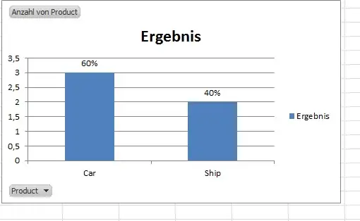
Desired output

Max M
  • 125

3 Answers3

0

If you have Excel 2016, this is very easy:

  1. Create chart as above
  2. Add data labels
  3. Format data labels
    Label Options > Select Value From Cells and select the cells that hold your % value

If your version of Excel doesn't support that option natively, then use Rob Bovey's excellent Chart Labeler to accomplish the same thing.

dav
  • 10,618
0

I actually ended up duplicating the data series using the Sum Values pane, made it percentage, and stacked it up to the first series, copied it to Word, and made the background fill white... and moved them a little to make it look nice. Not the smartest solution but worked for me.

tychen
  • 1
0

Create your chart with the bar series the same as you have in your picture. Then create a second series by bringing your metric into the Values pane a second time. Set that metric to show values as percentage. It will look strange at first.

Now go to Change Chart Type and choose Custom. Choose bar graph for your bar series, and choose line for your percentage series. It will still look strange.

Right click within the graph on the percentage line series and choose Add data labels. Right click again and choose Format Data Series. Click on the paint can. Under line, choose No Line. Under Marker, choose No Marker.

Now you have an invisible series with the labels that you want.