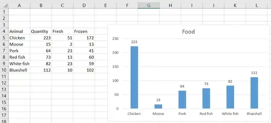
To get a chart showing “meat” vs. “seafood”,
you will probably need to have a separate range
that shows just those two categories.
You won't need to maintain the data separately;
just use SUM or SUMIF formulas.
You might also be able to do something
with a PivotTable and/or a PivotChart.
I'm not sufficiently familiar with those to give an answer;
probably somebody else will.
Once you create your “meat” vs. “seafood” chart,
there are multiple ways of displaying multiple data series
(e.g., “fresh” vs. “frozen”).
I suggest a “Stacked Column” chart.
