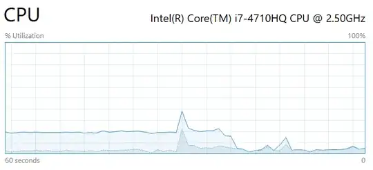
The windows 10 task manager suddenly shows two curves for CPU utilization, one light colored and one darker blue colored:

As far as I remember, it always used to show just one curve for current CPU utilization. What do the two curves mean? Which one should I trust to be correctly describing the resources spent on the current task?