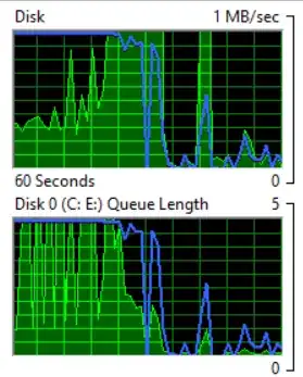
Windows Resource Monitor shows a graph of Disk Queue Length. E.g.:
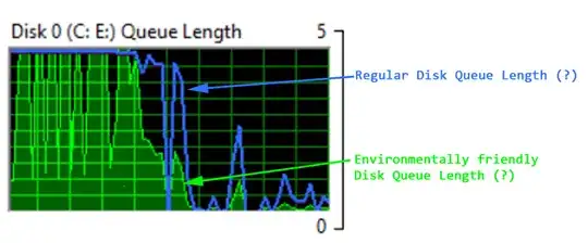
What does the green graph, and the blue line represent:
Research Effort
- In the Resource Monitor of Windows 7, what does the "disk queue length" really mean? (it's not Disk I/O and Highest Active Time)
- https://www.techrepublic.com/blog/the-enterprise-cloud/use-resource-monitor-to-monitor-storage-performance/
- Technet: Performance and Reliability Monitoring Getting Started Guide for Windows Server 2008
- https://serverfault.com/questions/280844/resource-monitor-disk-usage-scale
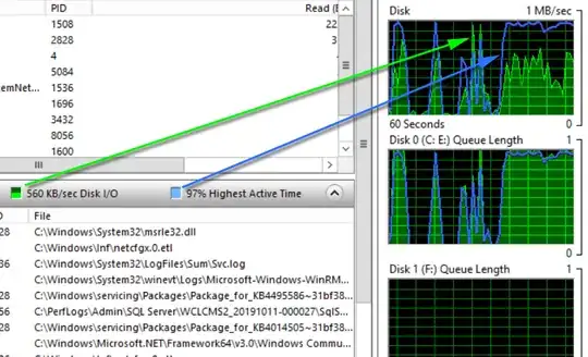
It is not Disk I/O and Highest Active Time
Don't forget, it is not Disk I/O and Highest Active Time, because it can't be both things for both graphs. Because both graphs are different.
- if it were the same thing
- for both graphs
- then both graphs would be the same
Also, one graph is Disk I/O (in MB/sec), and the other is Queue Length (in number).


