I'm charting the frequency of a range of numbers in a histogram in Excel 365. The numbers range from 236 to 1736 and I've got the bins at 250. Excel is automatically starting the histogram bins at the 236-486 range. I don't see an option anywhere to make it start at 0-250. Can anyone help me change it?
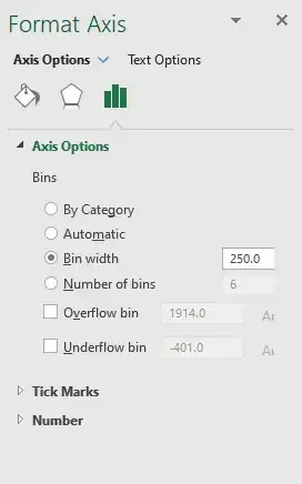
Formatting options:
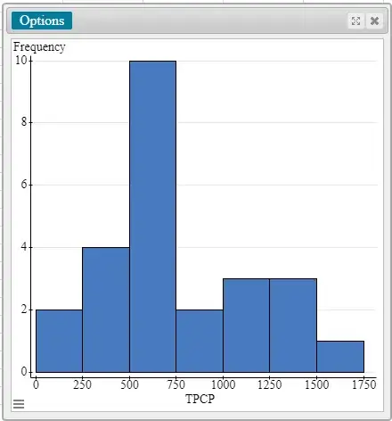
What I want it to look like:
The above was created in a different program that I have access to only through my school, using the same set of data. I'm trying to figure out how to do it in Excel because that's what I use in real life.
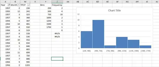
Here are a subset of my input data and the chart I get now:
(Ignore Columns A and B. Columns Y and Z represent the frequencies of the numbers in Column M; e.g., there are two values between 0 and 250, four values between 250 and 500, and so on.)


