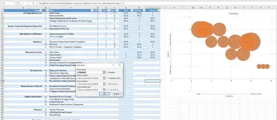
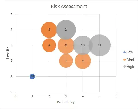
Hi I am attempting to make a similar bubble chart (or ANY chart) to what was posted here:
Can this 5-attribute 2D risk map be built in excel?
Problem is, it doesn't seem to work in Excel 2016. Seems like the bubble chart is NOT ignoring the #N/A values. It plots all three low, medium, and high series instead of just the rows in the series with values. Excel seems to be using the cell ROW reference as the X-value... makes no sense why it would do that when it literally requires you to specify a range of x-values in the data series.
Additionally, I also couldn't seem to get the second series to work either with the "numbers." I want each bubble to be numbered with MY column "B" so I know which bubble matches which line in the chart. When I follow the advice in the link all it does is add another bubble on top of the other one. No "#" value... and data labels does not allow me to change it as suggested.
Anyone know how to get this to work? Or, any suggestions on how to better plot these? Seems crazy such a simple task is so complicated in Excel. My only alternative seems to be to add EVERT SINGLE ROW as it's own series. That would be extremely time consuming and still doesn't solve the label problem! Is there some way to do this in power pivot/chart now?
Thanks!

