0

I've generated some plots with the below code:

#Remove group label from the dataframe
    data_just_feats <- data[ , -which(names(data) %in% c("Group"))]

Pca Plot

plot_1 <- autoplot(prcomp(data_just_feats), data = data, colour = 'Group', size = 0.001, frame = TRUE, frame.type = "norm") + scale_color_manual(values=c(col.5, col.4, col.3)) + scale_fill_manual(values= c(col.5, col.4, col.3)) + theme(axis.line= element_line()) plot_1

Which gives the following:

enter image description here

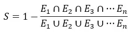
But what I'd really like is the % overlap of the ellipses?

I'm a bit lost of where to go as the PCA is generated in the plot and to the best of my knowledge the ellipse values don't exist outside of the plot itself.

(R Studio)

2 Answers2

0

You can use ggbuild to extract data from a plot. Then, you may be able to figure out a function to calculate the overlap.

Here's an example of ggbuild:

p <- ggplot(mtcars,aes(mpg))+geom_histogram()+
      facet_wrap(~cyl)+geom_vline(data=data.frame(x=c(20,30)),aes(xintercept=x))

pg <- ggplot_build(p)

5rrrrr
  • 68
  • 1
  • 6
0

I do not know if this could be of some use, either for OP or anyone else, but in spatial statistics, Wong (1999) proposed a "Separation Index" in order to compare the grade of separation between the different ellipses representing the average spatial distribution of different ethnic groups.

The index is stated as in this image

You substract 1 from the quotient resulting from divinding the area of the intersection of all ellipses and the area of the union of all allipses.

The index can take any value from 0 to 1, corresponding to total divergence or total convergence, respectively.This, however, doesn't have any statistical significance as far as I can understand, and it is just a descriptive measure.

Toto
  • 19,304
AlexVM
  • 1