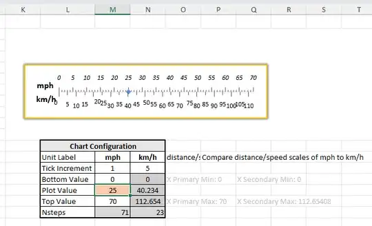
How can I use Excel to produce charts like the images below? Is it possible?
I want to have two different x-axis scales with major tick marks every 10 values. The only data I would want to display would be a single data point, like a dot centered on the line, or a bar going from 0 to the value.
My desire is to generate a series of these images with dynamic ranges for temperature, weight, distance, and speed. My goal is to be able to produce these as cheat sheets or overlays to videos where one unit of measure is being discussed and people can quickly relate to what it may be in another unit of measure. In some cases I may want to show a line with a weight range of 10 kg to 80 kg, and another time may be 0 kg to 100 kg.
If this isn't possible in Excel, can it be done in Power BI or another system that is readily available?


